Oculus is a virtual reality company, which was created in 2012 with the mission of revolutionizing VR for gaming. Its original product was called the Oculus Rift. Now, its range of virtual reality headsets also includes the Oculus Quest line. The brand was purchased by Facebook in 2014.
Meaning and history
Despite its simplicity, the Oculus logo is meaningful and effective.
What is Oculus
Oculus makes virtual reality headsets, namely the Oculus Rift and Oculus Quest ranges. The brand belongs to Facebook Technologies, LLC, which is a subsidiary of Facebook Inc. Despite multiple concerns about the addictive nature of the technology, it’s growing more and more popular.
2012 – 2015
At Electronic Entertainment Expo (E3) in the summer of 2012, the Oculus Rift prototype was unveiled. The Rift was a new head-mounted display, which was supposed to be both more efficient and less expensive than those available back then. The prototype was developed by Palmer Luckey, who was an HMD designer and a moderator in specialized discussion forums. Luckey created Oculus VR in collaboration with four co-founders.
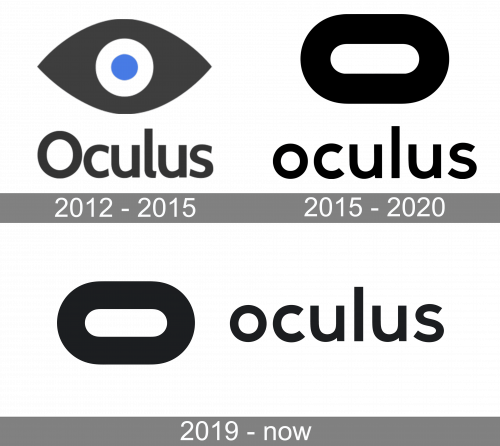
Originally, the centerpiece of the logo was a stylized eye. The eye looked very unusual due to the colors. Its pupil was of a rich and saturated shade of blue, while the iris was white. The part of the eye that should have been white was dark gray. Also, the eye was huge.
Next to the emblem, you could see the wordmark in a sans serif type. We can hardly say that the shape of the emblem somehow rhymed with the typeface. The “o” was an ellipse, which didn’t let it counteract with the circles of the eye. That said, it was a clear and highly legible type, which was an advantage in itself.
The Oculus logo created an adequate link between the emblem, the product, and its name. First, the emblem gives a clear hint that there is something to do with vision. The name also alludes to vision, as the word “oculus” means “eye” in Latin. Also, the emblem contains circles, which in a way echoes the initial letter of the company name, albeit this resemblance isn’t very straightforward.
2015 – 2020
The updated design created an excellent link with the product. It was more unique and, due to this, better recognizable than the previous design.
Firstly, the eye can be seen in lots of logotypes. The ellipsoid represents the virtual reality headset not worse than the eye did but is a less generic symbol. Also, it still echoes the shape of the initial letter of the company’s name, although again, this similarity isn’t emphasized in the typeface chosen for the logo.
Another advantage of the updated logo is the use of negative space. The white part inside the ellipsoid seems to stand out like a nob. It is also similar to the shape of the slider on the underside of the reality headset.
Another interpretation is also possible. The ellipsoid may represent the shape of the mouth of a person wearing a reality headset at the moment when her jaw drops open with amazement.
2019 – Today

While the emblem and the wordmark are often used independently, they can be also paired in a stacked version of the logo.
The designers behind the new logo were Cory Schmitz, Mackey Saturday, Nicolaus Taylor, and Jon Malkemus.
Colors and Font
The black and white palette seems like a safe choice. There is also a more or less clear link with the colors of the product. In the case of such a clean and minimalist logo, this choice of colors seems fully justified.
The type is as clean and straightforward as the emblem. Also, it looks pretty much like the one used in the original Oculus logo, with slight modifications. For instance, the rounded lower end of the “l” was cut off, to make the design cleaner. There is also more air between the letters.


