The Cheap Monday logo has caused much controversy due to its obvious Satanic and/or occult symbolism.
Meaning and history
The history of the brand started in 2000. It was founded as a second-hand clothing store in a suburb of Stockholm.
In 2008, H&M purchased the brand. However, in late 2018, H&M announced the brand would be closed within less than a year due to poor sales.
What is Cheap Monday?
Cheap Monday is the name of a Swedish brand of men’s and women’s clothing and accessories, owned by the Swedish company Hennes & Mauritz AB (H&M). Founded in 2000, today the brand is loved by young people from all over the globe for its bold and cool clothing and affordable prices.
2004 – 2010
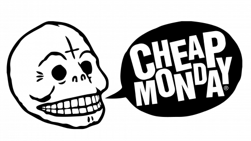
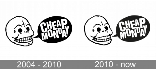
The Cheap Monday logo, designed in 2004, was composed of a contoured scull image, with the cross on the forehead, and the large teeth in a wide scary smile. In the right from the scull there was a black dialogue bubble, with the heavy white lettering with the name of a brand written in the uppercase of a custom sans-serif font. It was a very cool and recognizable badge, which perfectly reflected the mood and essence of the brand.
2010 – Today
The redesign of 2010 has kept the initial design concept of the Cheap Monday badge, but refined the contours of the graphical part, with the cross replaced by a vertical line, and the teeth slightly rounded, and gaining a thicker black outline. As for the right part of the badge, it remained untouched.
Emblem

The original logo featured a skull with an inverted crucifix on the forehead. The authors of the emblem, Björn Atldax and Karl Grandin of the design group Vår, explained that the anti-Christian symbolism was used deliberately, as a statement.
As Atldax explained, he was not a Satanist, but he personally disliked organized religion, especially Christianity. He claimed the religion to be “a force of evil” and the root of many wars.
Eventually, the company still removed the inverted crucifix from the logo. Only a single vertical line was left instead. The change occurred by 2010. The grinning skull was still there, though.
Although the Cheap Monday logo became less provocative, the company still went on using Satanic and/or Illuminati symbolism in its collections. For instance, you could find triangle T-shirt designs similar to the well-known Illuminati pyramid.
Font and Color
The custom uppercase lettering from the official Cheap Monday badge is set in a unique sans-serif font with massive lines, and stable contours of the characters. Due to different sizes of the letters and their “jumping” placement, the inscription looks like nothing else. The closest fonts to the one, used in this insignia, are, probably, Industrial Gothic Pro Double Line or Untrouble Regular but with significant modifications.
As for the color palette of the Cheap Monday visual identity, it is based on black and white, the most popular color combination in the world of fashion. It makes the funny badge look more serious and professional, evoking a sense or determination, strength and rebellion.


