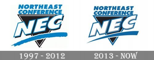
While the logo of the Northeast Conference went through an update in 2013, the modifications were so subtle many people did not even notice them.
Meaning and history
Established in 1981, the Northeast Conference emerged from the collaborative efforts of several academic institutions, aiming to create a cohesive and competitive athletic league within the NCAA Division I framework. This initiative was spearheaded by visionaries who valued both the athletic prowess and academic vigor of student-athletes. Throughout its journey, the NEC has achieved noteworthy milestones, including the expansion of its sports programs to encompass a wide spectrum of athletic disciplines, thereby embracing a diverse range of talents and interests among students. A hallmark of the conference’s success lies in its unwavering commitment to academic excellence, ensuring that student-athletes thrive in their educational pursuits alongside their sporting endeavors. Presently, the Northeast Conference stands as a distinguished entity within the NCAA, acclaimed for its dual focus on fostering exceptional athletic talent and maintaining rigorous academic standards.
What is Northeast Conference?
The Northeast Conference is an esteemed collegiate athletic consortium within NCAA’s Division I, comprising universities primarily situated in the Northeastern U.S. It is renowned for promoting a harmonious balance of athletic competitiveness and academic achievement among its member schools.
1997 – 2012
On both the old Northeast Conference logo (adopted in 1997) and the newer one (adopted in 2013), there is a black triangle with the abbreviation “NEC” written across it. Both the emblems feature the full name of the conference in two lines above the triangle. Also, you can see a blue line in each of the two emblems.
2013 – Today
However, in the older logo, the underline has an uneven border. It looks as if it has been painted with a brush. By contrast, the current logo features an underline with a very clean border. The shade of blue is slightly different, too.


