 Nine Network Productions Logo PNG
Nine Network Productions is the name of one of the Nine Entertainment tv channels, which was established in Australia in the middle of the 1950s. Today Nine Network is the most popular free TV channel in the country, which broadcasts both Australian and International content.
Meaning and history
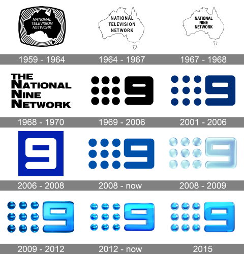
One of the oldest and most-watched channels in Australia, Nine Network has had many experiments with its visual identity throughout the years. The long history of the commercial channel includes more than a dozen of redesigns, with three of them being major.
1959 – 1964
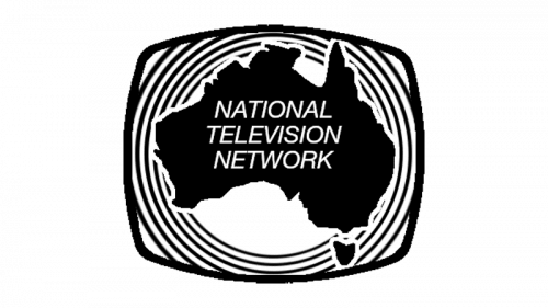
The very first logo, designed for Nine Network was executed in a black-and-white color palette and featured the contouring of the Australian continent as the main element. It was set in solid black, with the white uppercase “National Television Network” lettering in a traditional sans-serif on it. The continent was placed on a rectangle with arched-out sides, standing for the tv screen, and decorated with numerous medium-thin circular outlines over the white background.
1964 – 1967
The redesign of 1964 simplified the logo of the tv channel, keeping the continent contour and the monochrome color palette, but removing all extra elements and reversion the colors. This, now the logo featured a white Australia continent in a black outline, with the black three-leveled inscription in the uppercase of a slightly narrowed sans-serif typeface. Both the lines and the letters gained some space between them, so the whole badge started looking cleaner and more modern.
1967 – 1968
The contours of the logo and the inscription were changed in 1967 after the National television Network was renamed into National Nine Network. The outline of Australia became thinner, and the letters in the logotype — bolder. The typeface was changed; with the letters getting more square and solid, while the space between the elements was reduced, so now everything looked more confident and powerful.
1968 – 1970
Another redesign was held just a few months later, in 1968. The new concept looked modern strong and laconic. That was only the lettering, set in four levels and executed in bold extended sans-serif letters, with clean straight lines and square cuts of the bars. The three lines, starting with emboldened capital “N”s were placed under the uppercase “The” set in the capitals of a slightly smaller size.
1969 – 2006
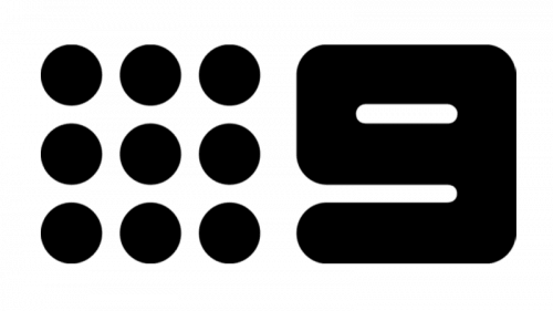
In 1969 the network gets rebranded again, changing the name to Nine Network Australia, and switching to a completely redesigned visual identity, which still featured the traditional black and white color palette. The new concept was abstract and progressive, with nine solid black dots forming a square and set on the left from the stylized digit “9” in square shape but with the lines and angles rounded. The new logo was created by Brian Sadgrove.
2001 – 2006
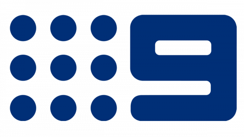
The redesign of 2001 was held by Velvet Mediendesign bureau, and kept the idea of Sadgrove, adding color and more uniqueness to it. The contours of the “9” were refined and the digit got more white in its negative space, while the nine solid dots became bigger. As for the color, it was the first time, when the network changed its traditional black to deep blue, which looked calming, professional, and extremely stylish.
2006 – 2008
In 2006 Bruce Dunlop Associates created a bright minimalist badge for the channel, placing its recognizable “9” (this time executed in solid white) on a bright blue square. The contours of the digit were refined and it started looking more delicate, while the new color palette added distinction to the simple logo and made it look stylish and eye-catching. Although it was a very modern and cool logo, it only stayed with the network for less than two years.
2008 – Today
The redesign of 2008 brought back the Sadgrove concept to the Nine Network logo. The square digit with rounded angles and nine solid dots in a square on its left were refined and colored in medium-blue with calm deep shade, evoking a sense of safety, confidence, and stability. This logo is still in use by the channel and can be seen on most of its materials.
2008 – 2009
As an experiment, the new logo was designed for the network in 2008, and although it only stayed for a few months, it started a whole era of three-dimensional Nine Network emblems. It was a light blue gradient composition with all elements executed in 3D, with a gel-like translucent surface. It looked cool and futuristic, making the channel stand out on the list of its competitors.
2009 – 2012
The redesign of 2009 made the logo even more voluminous, replacing the nine dots with nine spheres and changing the color palette to darker and glossier blue. The “9” was executed in slighter lighter shades to balance the whole emblem, and not overweight it. The spheres looked sleek and resembled caramels with their juicy gloss.
2012 – Today
Another three-dimensional logo was introduced in 2012, fully based on the previous badge, but with the enhanced color palette, which uses lighter shades of blue and more white gradients, which makes all elements look elegant and sleek. As for the style, shape, and size of the dots and the digit, everything remained untouched.
2015 – Today
In 2015 the secondary logo for Nine Network was created. Same gel-like three-dimensional concept, but with the dots a bit smaller, and the nine — bolder. The color palette is still based on shiny gradient blue, but the main shade is now brighter and more vivid.


