

![]() Nimes Olympique Logo PNG
Nimes Olympique Logo PNG
Nimes Olympique is the name of the French football club, which was established in 1937 in Nimes. Today the club plays in Ligue 1 and has Jerome Arpinon as the head coach.
Meaning and history
![]()
Since the beginning of the 1970s, the visual identity of the French football club has been pretty consistent in terms of main symbols, structure, and colors. The emblem has been more or less the same until 2017, only the shades and contours have been modified from version to version.
The 1970s — The 2000s
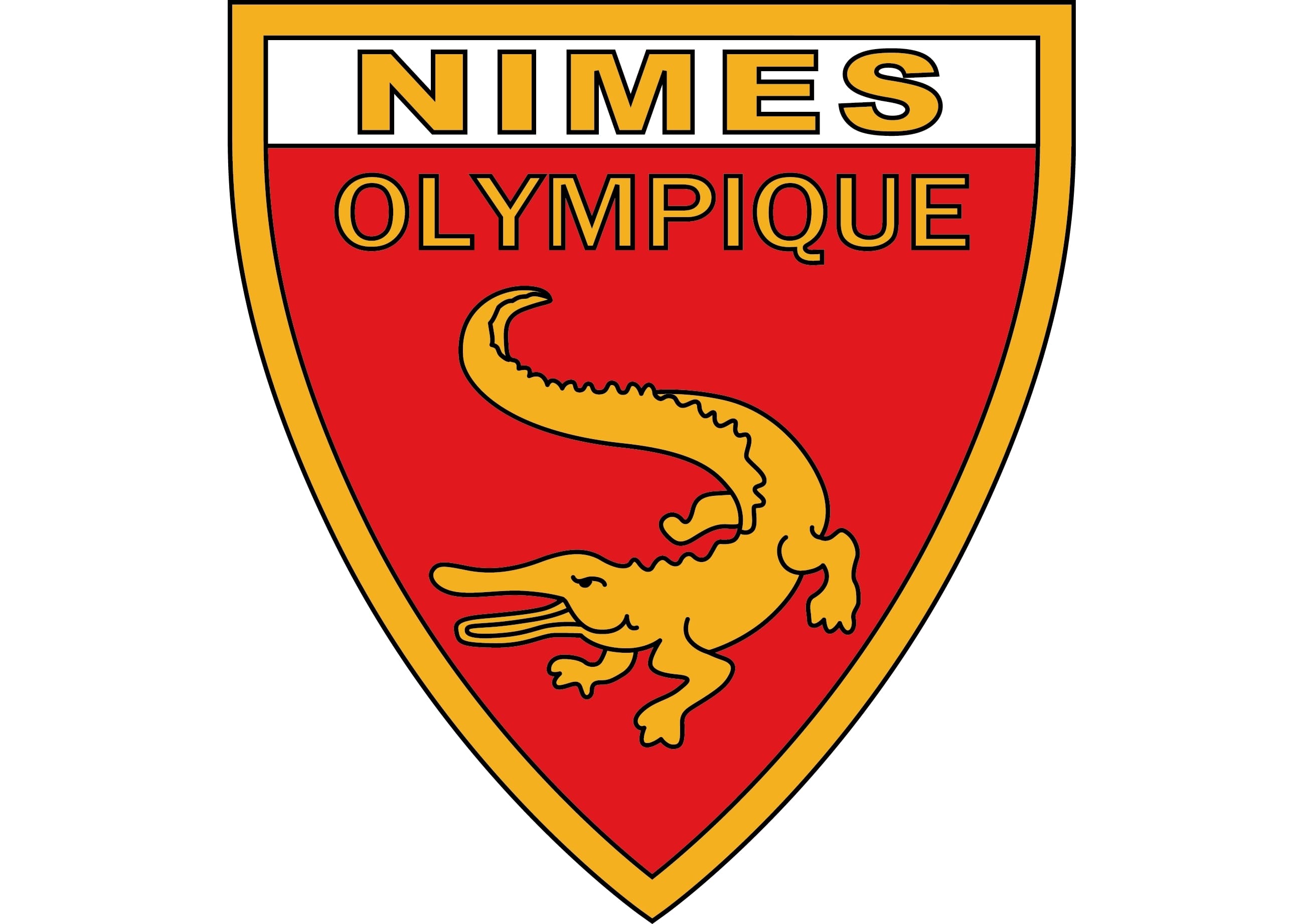
The official Nimes logo from the 1970s boasted a classic triangular shield with arched sides. Executed in red and white, the shield featured a thick gold frame in a delicate black outline, balanced by the team’s symbol image and the wordmark.
The golden alligator with its mouth open was placed on the bottom part of the logo, featuring solid color and a thin black outline. The dangerous and wild animal repre-sents the club as a serious competitor and shows their courage and willingness to win.

As for the wordmark, its upper part, “Nimes”, is written in a bold sans-serif typeface with straight clean lines and placed on a white background, when the “Olympique” part features thinner and more elegant lettering and is placed on red.
A bit later the logo is being slightly redesigned — the black contours of all the details become bolder, except for the “Nimes” lettering. Now it is drawn in light gold without any outline.
The 2000s
At the beginning of the 2000s, the club’s emblem is being redrawn and simplified. Now the modern badge is composed of a solid red shield with the white rectangle on its top part. As for the symbol, the alligator is colored white and has a football in its mouth.
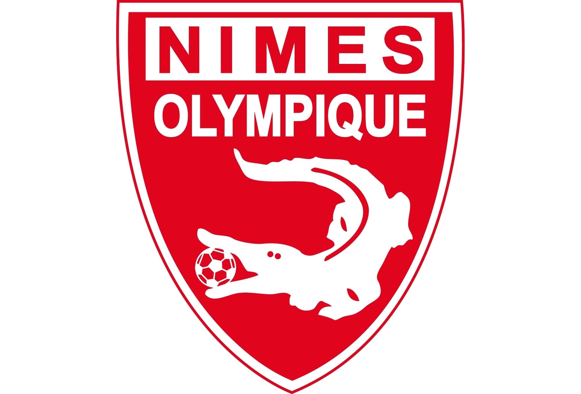
The wordmark of the club in traditional geometric sans-serif is split into two levels — the “Nimes” in red is placed in a white rectangle, while the “Olympique” featured white letters on red.
After a few years, the badge gains a double white and red thin outline and the ball in the creature’s mouth becomes red with white details.
2017 — 2018
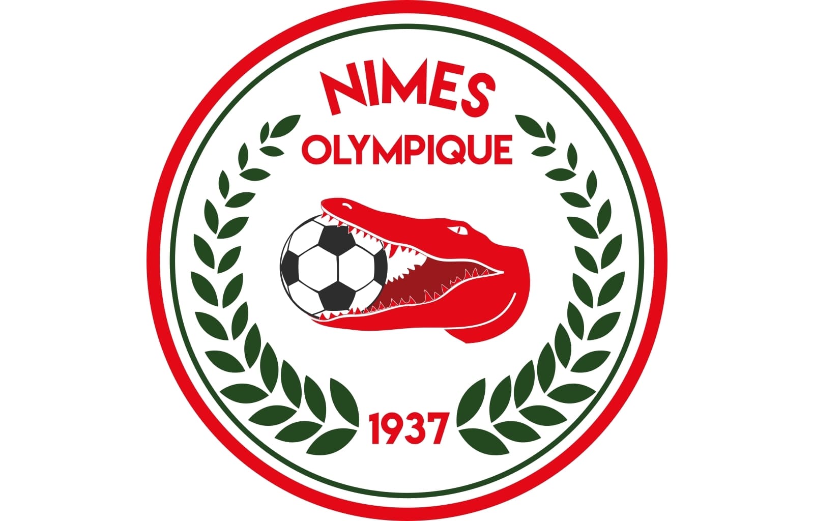
For only one year the club decides to completely change the style of its visual identity. The shield is being replaced by a circle with the red alligator’s head in the middle. The football in its mouth is now black and white.
Another significant change is the color palette — the new dark green shade is added to the composition. Two laurel branches are placed along the badge’s perimeter, on the left and right of the symbol.
The wordmark in red is placed on the upper part of the badge, with the “Nimes” in all capitals arched, and “Olympique” placed under it in a straight line.
2018 — Today
![]() The new emblem was created for the French club in 2018. It is a modern and mini-malist badge, which is based on all the previous versions, but with a stronger and more progressive character.
The new emblem was created for the French club in 2018. It is a modern and mini-malist badge, which is based on all the previous versions, but with a stronger and more progressive character.
The iconic shield is now white in a sleek red outline. The alligator was replaced from the bottom part to the top, and now it’s just a stylized red head of the creature, facing right.
The main part on the shield itself is now a wordmark, executed in a bold geometric sans-serif. Three solid arched are placed under the lettering, separating it from the small “1937” inscription, celebrating the club’s foundation date.


