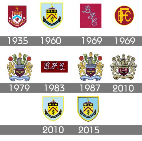
The English professional football club Burnley bears the name of the town where it is based. Its history dates back to 1882. Since then it has experienced ups and downs, but each time it manages to survive. When we say “Burnley logo” we mean their emblem which is sometimes referred to as a badge or a crest.
Meaning and history
The history of Burnley FC logo started in 1886. That year Prince Albert came to the stadium Turf Moor to watch the match between Burnley and Bolton. It is unclear why the monarch didn’t stay to watch the second half. Still, some time later the team got presents ‒ jerseys with the Prince of Wales’ coat of arms.
1935 – 1960
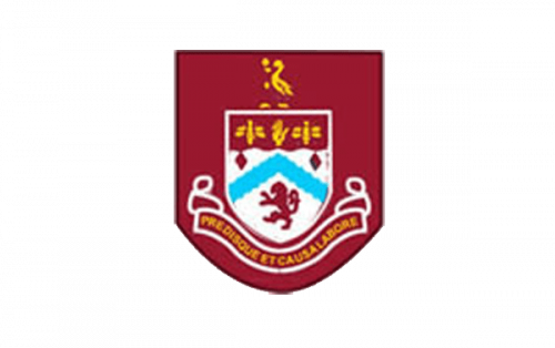
The Burnley logo, used by the club in the 1930s, was based on the classy heraldic symbol — the Prince of Wales’s coat of arms, executed in burgundy, white and yellow color palette, with come light blue elements. The crest was placed on a bigger solid burgundy crest-shaped background and was accompanied by an arched ribbon with yellow lettering and an elegant yellow image of the bird in the upper part of the logo.
1960 – 1969
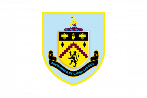
The redesign of 1960 switched the color palette of the Burnley logo, and now the bigger crest featured light blue, and a thick yellow framing, which was balanced by the smaller yellow crest. The ribbon with the lettering was now executed in black, and balanced by the upper part of the Prince of Wales’s coat of arms, in black with three yellow symbols.
1969 – 1975
In 1969 the club started using a very simple and even naive logo — three diagonally placed letters “BFC” in light blue. The symbols were executed in a very elegant cursive typeface and set from the upper left corner to the bottom right. This badge was used by Burnley for six years.
1975 – 1979
The redesign of 1975 introduced a new modern badge of the British club. It was a solid burgundy circle in a yellow outline, with a stylish yellow “BFC” monogram on it. The strong uppercase letters were executed in a strict and clean bold sans-serif typeface.
1979 – 1983
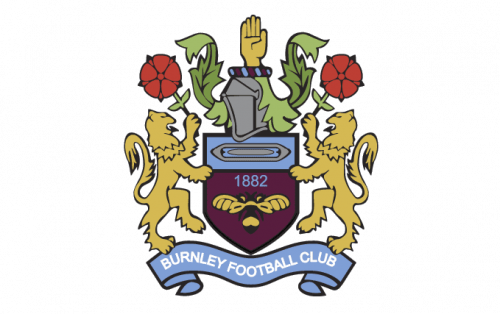
The heraldic logo came back to the club’s visual identity in 1979. It was a new ornate and royal badge with two rampant lions holding red roses on the sides of the dark purple crest with the “1882” blue datemark on it. The light blue ribbon with the white uppercase lettering on it was placed under the graphical part of the Burnley visual identity.
1983 – 1987
In 1983 the club starts using a simple monogram as its official logo against this time three italicized cursive letters were written in dark burgundy, close to purple, and set in one line, separated by three solid dots in the same color.
1987 – 2009
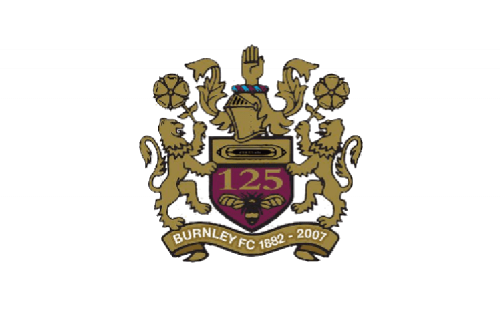
The crest from 1979 came back to the Burnley logo in 1987 but in a new color palette. It was made to celebrate the 125 anniversary of the club, so the new color scheme was built around the lost royal colors — gold and burgundy. The enlarged “125” in bold gold lines were written on the crest in the middle of the composition. And the wordmark in white was set on the ribbon under the badge, followed by the “1882 — 2007” datemark.
2009 – 2010

In 2009 the logo created for the club in 1960 becomes official again. The only difference between the new and the original versions were in the inscription on the ribbon at the bottom of the badge. The new version featured a bright blue “Pretiumque te Causa Laboris”, which is Latin for “The prize and the cause of our labor”.
2010 – 2015
The redesign of 2010 was again only about the lettering on the ribbon. This time it featured the traditional “Burnley Football Club” inscription in the uppercase of a simple yet strong sans-serif typeface, in light blue. It looked neat and professional.
2015 – Today
In 2015 the lettering on the black ribbon was redesigned again. Though it is still the “Burnley Football Club” nameplate, the style of the inscription was switched to a bolder and more powerful one. The color palette remained the same, but the mood gained more confidence and determination.
What is Burnley?
Burnley is the name of one of the oldest British football clubs, which is also known to be in the list of the pioneers to become a professional team. The club from Lancashire plays on Turf Moor arena and is nicknamed “The Clarets”.
Burnley Colors
BURGUNDY
PANTONE: PMS 222
HEX COLOR: #6C1D45;
RGB(108,29,69)
CMYK: (20,100,22,61)
LIGHT BLUE
PANTONE: PMS 2975
HEX COLOR: #99D6EA;
RGB(153,214,234)
CMYK: (34,0,5,0)
YELLOW
PANTONE: PMS 222
HEX COLORede939:
RGB(237,233,57)
CMYK: (6,0,72,0)
GOLD
PANTONE: PMS 7409
HEX COLOR: #F0B323;
RGB(240,179,35)
CMYK: (0,31,100,0)


