Nick Jr. is one of the best-known pay television channels for preschoolers in the United States. It went live in the fall of 2009. Originally, it was formed as a spin-off of the preschool programming block of the same name, which was broadcasted by Nickelodeon. Today, both the original Nick Jr. block and the channel of the same name are running.
Meaning and history
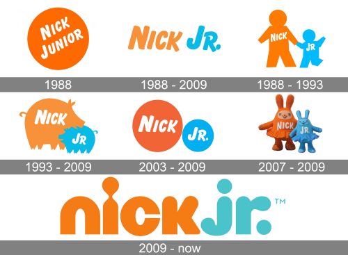
The Nick Jr. logo has had over 150 versions. The core that united virtually all the versions before 2009 was the wordmark, which remained almost unchanged. In 2009, the wordmark was updated, which became the starting point for a new generation of logotypes.
1988 (pre-launch)
Even in these early examples, we can already see the recognizable wordmark. The very shape of the glyphs makes it look playful, friendly, and casual.
This effect partly results from the rounded ends of the glyphs. Also, the letters in no way look serious. At some points, the ends go beyond the lines – take, for instance, the lower right ends of the “k” and “r,” which stretch further than they should. The same applies to the “r” with its casual stroke in the top part. Due to it, the wordmark looks as if it had been quickly written by hand.
The letters are somewhat plump, which also contributes to the friendly effect.
What is Nick Jr.
Nick Jr. is a TV channel intended for preschoolers. It is run by ViacomCBS using its domestic networks division’s Kids and Family Group. The channel’s offer includes various educational and entertainment programs.
In the basic version of the logo, the wordmark was orange on the white background. There was also a version, where the two words were placed inside a larger and a smaller circle. Additionally, the name of the brand could be placed inside an orange gnome or a leaf.
1988 – 2009 (wordmark)
In addition to the basic wordmark described above, a full one was sometimes used. Here, both the words were written without being shortened. The first line read “Nickelodeon” (white inside an orange rectangle), the second line read “Junior” (white inside a light blue rectangle). This emblem could be seen on the French version of the channel in 1999, for instance.
1988 – 1993
A series of versions of the Nick Jr. logo was designed featuring a combination of a bigger and a smaller object. They symbolized that the channel should be watched by kids accompanied by their parents. Here, the word “Nick” was placed inside the bigger object, while “Jr” was placed inside the smaller object.
The objects included apples, bees, bricks, stars, butterflies, cars, cats, comets, crowns, fish, flowers, frogs, koalas, ladybirds, musical notes, robots, tops, trains, castles, musical instruments, planets, and more.
1993 – 2009
This is when the iconic father-and-son emblem was introduced. In 2003, the majority of the animal and parent and child versions stopped being used, although they still could sometimes be seen in some of the shows. The list of animals included alligators, bats, bears, birds, camels, caterpillars, chickens, cows, and dinosaurs, to name just a few.
2003 – 2009
We should also add that there was a series of logos developed during this period that had a more detailed design. For instance, in many of them, facial features could be clearly seen. Some of them were even colored in a different way.
2007 – 2009
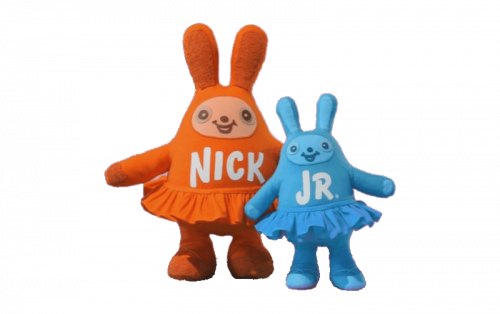
We should also include a series of 3D, highly detailed logos (bunnies in tutus, robots, beardogs, space monkeys, skaters).
2009 – present
This has been the most notable update because it affected the basic wordmark. The glyphs were lowercased and redrawn.
Colors and font
In spite of the multiple updates, the Nick Jr. logo has always preserved its friendly and casual style, with plump and rounded letters, as well as the basic palette.


