Nexus is the Tyne and Wear Passenger Transport Executive (TWPTE).
Meaning and history
The Nexus organization in its current form started in 1968, under the name Tyneside PTE, and was renamed in 1974. Today Nexus is responsible for running the Tyne and Wear Metro, ferry services, and the provisioning of supported bus service and infrastructure.
The main sphere of the company is Tyne and Wear Metro, which is a light-rail rapid transit system serving Newcastle-upon-Tyne and its environs, including Gateshead, North Tyneside, South Tyneside, Sunderland, and Newcastle International Airport. The network started opening in stages, in August 1980, and currently serves a total of 60 stations with two lines covering almost 80 km of track.
What is Nexus?
Nexus is the name of the main British metro transportation operating company, which was established in 1974, replacing the Tyneside PTE, the operational arm of the Tyneside Passenger Transport Authority, created in 1968.
1969
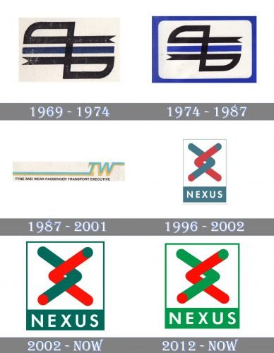
The original logo was very intricate, to say the least of it. It was formed by two lines, one of them black, the other one dark blue. The black line formed a pattern looking like two symmetrical flags. The ends of the line were cut out to make up two triangles. The dark blue line was straight and was placed right in the middle of the logo.
You could find all the initials of the words forming the name of the brand in the lines of the emblem, although they were not immediately obvious.
1974
In spite of the fact that the emblem was difficult to grasp and decipher, it was used for almost three decades almost unchanged. The only notable modification took place in 1974 when the blue grew brighter and a frame was added. During this period, the company was already called Tyne and Wear Passenger Transport Executive.
1987
A dramatically new design was unveiled. There was a long straight line ending with the letters “T” and “W.” The full name of the company in small letters could be seen below.
This version was more meaningful (the line looked like the road) and easier to decipher than its predecessors.
1996
The brand identity went through a total overhaul including a new, easy-to-remember name and a more minimalist emblem. The emblem was formed by two arrowheads resembling two roads. The word “Nexus” in an austere sans came below.
2002
The red grew brighter, while the grayish-blue was replaced by a more vivid shade of green. As a result, the logo became more eye-catching.
2012
An additional Nexus logo was introduced featuring a lighter and brighter shade of green combined with a slightly more muted red.
Font and Color
The clean geometric lettering from the primary Nexus badge is set in a medium-weight modern sans-serif typeface, which is pretty similar to such fonts as Futura BT Pro Bold, Futura EF Heavy New, or Futura Now Text Bold.
As for the color palette of the Nexus visual identity, it is based on green and red elements with an addition of white, adding air and lightness to the intense combination. Green is the color of growth, development, and progress, while red is all about power and passion.


