Winnipeg, the capital of the province of Manitoba, Canada, is presenting itself as a tourism brand with a new visual identity. The “Place Brand” was created to increase the attractivity of Canada’s seventh largest city.

Launching a new brand, the economic development department of the metropolis with a population of 700,000 is aiming to promote the tourism sector and make the city “more attractive for investors and talents”, according to an official statement. Based on market research and a survey among local residents, companies, and other stakeholders, a proper brand concept was developed, named “Winnipeg: Made from what’s real”.

Explaining why the city needs a place brand, the officials said a new visual identity “will help get to the heart of the city in every story we tell to each other and to the world”. Thus, the new city brand is a kind of a story of Winnipeg told by Winnipeggers.
Winnipeg’s previous logo featuring a cornered “W” was introduced only five years ago. It was originally used as an emblem for Economic Development Winnipeg, and then for the city’s integer tourism brand. Unlike that old logo, the new one will serve as a place brand only.

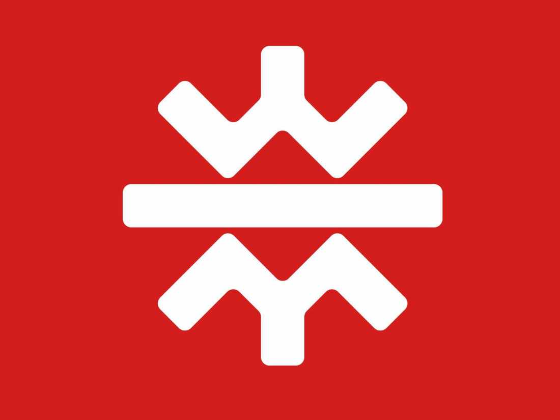
The new symbol is purposely designed to offer multiple meanings. The upper “W” stands for Winnipeg, placed over the center line symbolizing the Red River on which the city lies, while the mirrored form of the lower “M” means the Manitoba province. The centered structure of the emblem alludes to Winnipeg’s location in central Canada. In general, the idea of the city’s symbol was to create a sign that would describe Winnipeg as a meeting point for different cultures. The logo can also be interpreted as the rising sun, which symbolizes shining optimism and people’s warmth, or as a snowflake. This sign seems cultural; however, it doesn’t belong to any community, it belongs to all Winnipeggers, as the official explanation goes.


