

Oktoberfest, a famous beer festival that is annually held in Munich, Germany, has received its first-ever logo in its 212-year history. The integer visual identity for the world’s largest people’s feast is intended to create a visual base, improving marketing.
![]()
While the Munich Oktoberfest was canceled in 2020 and 2021 due to the coronavirus pandemic, this year’s edition will still take place (September 17 – October 3). Besides the brand identity, the festival has got a module design system including a color palette, typography, and general visual language.
According to Benedikt Brandmeier, the head of the Tourism and Hospitality department, it’s been important for the City Council to create a visual identity that would be perceived as typically Bavarian. “The branding combines the tradition and the present. The design leaves the possibility for interpretations, working for every target group”, he added.
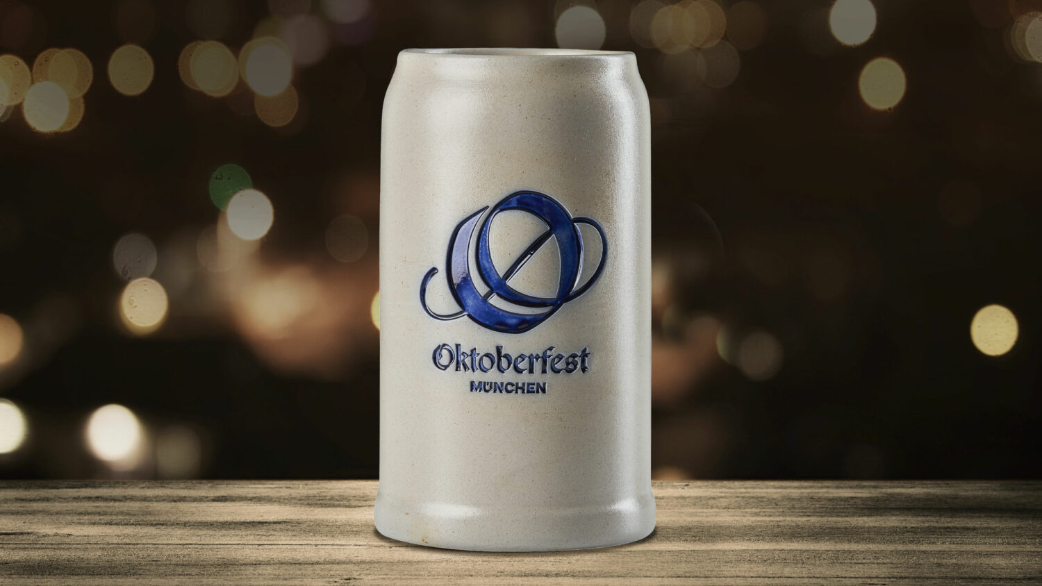
The initial “O” designed with a vignette serves as the central element of the brand identity. Instead of a specific image like a beer mug, a heart, or a Ferris wheel, the designers consciously decided on an abstract form to offer more room to interpret it. As an official statement says, the dynamism of the O-sign reflects the spirit of the Oktoberfest.
The logo and the custom typeface Wiesn, which is called after the festival’s local nickname, are based on the traditional polygonal font that was widely used in Bavaria in the times of the Oktoberfest’s inception. They were designed in a modern and comprehensive way to be readable for an international audience.


