

Warner Bros. needs no introduction. Everyone knows and loves the movies and cartoons that start with its famous WB shield. In 2023, the studio is going to celebrate its 100th anniversary. So, moving towards to this event, it is thinking of refreshing its identity.
Although the WB emblem is quite recognizable and tells a lot about the company’s heritage, Warner Bros. still feels the need to meet the requirements of the modern times including the branding issues. For a rebranding, the company applied to Pentagram, a renown design studio that collaborated with many companies working in different spheres.
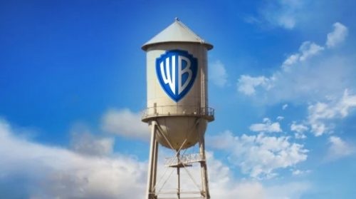
Pentagram has exactly determined what alternations in Warner Bros.’ branding need to be done to make it more effective for a contemporary entertainment business. The WB logo was redesigned to be equally good-looking on screens in cinemas, TVs and mobile devices. While redrawing it with more clean and sleek forms, the designers employed the golden ratio principle giving the shield and letters within it a better sense of balance. The letters “WB” themselves have undergone the most radical overhaul – now they are in a sans-serif typeface referring to the Art Deco style which was popular about 100 years ago, when Warner Bros. was founded.

Another remarkable thing about the Warner Bros.’ rebranding is that the Pentagram team have created two versions of the logo – a flat variant which will be used as a primary emblem and a secondary version with a dimensional design that is going to be used for the company’s TV projects.
As Warner Bros.’ vice president Dee Dee Mayers said, a rebranding of a world-famous company with a rich heritage is a real challenge. The most important thing about it is to find a balance between keeping traditions and modernization. And that is the case of Warner Bros. whose renewed identity connects the past and the future.


