

Established in 1951, Saga Group is a British company offering insurance, travel, financial services for people who are over the age of 50. Through its divisions, the enterprise provides holiday tours, a wide range of insurance products, credit cards, saving accounts, and much more. Marking over 70 years of its journey, Saga has updated its visual identity forged by one of the UK’s most prominent design agencies SomeOne.
Involving Saga’s employees and customers into the rebranding process, the SomeOne team worked out the basic principles for the new look of the company that should convey, among other things, the idea of a “more positive side of getting older”. Also, the “experience” and new technology themes were added to the branding.
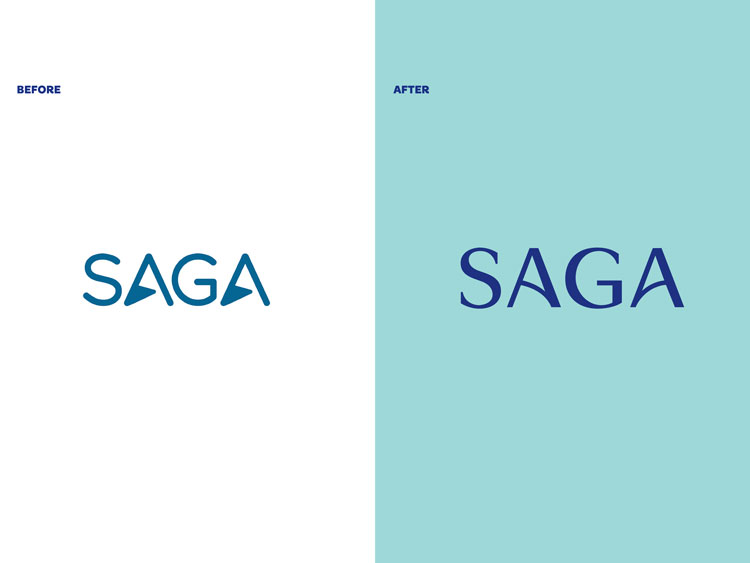
The designing team redrew the Saga logo, adding forms that were taken from railings at a hotel owned by the company. So the triangular elements in the ‘A’s were replaced with arc-shaped crossbars, while the whole wordmark was redesigned in a serif typeface. The openwork balustrade also gave an idea of a special symbol for the brand that, along with other patterns, makes up Saga’s new visual identity.

A significant role in the Saga branding is played by marbling. According to Ian Dawson, the head of the SomeOne team, this is a “timeless visual theme”, and, as people from focus groups said, it is associated with solid values and high-level service. The marbled design is applied to Saga’s promotional materials and merchandise.
The company’s updated look also includes a new typographic system. It is specially developed for Saga Magazine which is considered as the biggest selling monthly subscription magazine in the UK, having a circulation of 620,000.


