As many businesses today, Schweitzer Mountain Resort, located near Sandapoint, Idaho, is facing some difficulties due to the COVID-19 pandemic. The enterprise has already suspended its extension plan for 30-unit boutique hotel. However, hoping for better times, the resort decided to refresh its look by rebranding itself to simply Schweitzer and adopting a new logo.

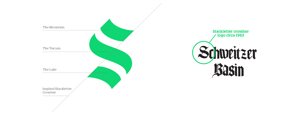
On its website, Schweitzer shared some details about the renovated visual identity, saying that its new emblem pays tribute to its heritage, while embracing its future. Now, the symbol of the ski resort is a stylized “S” formed by three strokes whose design Schweitzer describes as symmetrical and balanced. The strokes, aligned on a 45º angle, symbolize the resort’s three main beautiful sites – the summit in height of 6,400 ft, flowing terrain and Lake Pend Oreille.
The overall design of the “S” is based on the old Schweitzer logo, used more than 50 years ago, which featured a Gothic typeface, hence, according to a statement from the enterprise, this demonstrates the connection with Schweitzer’s past. The “S”’s green is a primary brand color referring to Schweitzer’s connection to the natural environment. The whole brand color palette also includes yellow and orange which were inspired by the dynamic tints of outdoor wear and equipment.

At the same time, the logo got some criticism, while posted online. Users noticed its similarity to the emblem of the Seattle Kraken hockey team. However, responding to critical comments, Tom Chasse, Schweitzer’s chief executive, said that the resort’s logo was in the process of development when the Kraken presented its “S”. Chasse added that Schweitzer will not change this emblem just because it resembles another logotype. He also recalled that the snowflake logo the enterprise had before met negative backlash as well, and it’s no surprise that changes are hard to accept for some people.


