

By winning this year’s Copa del Rey, Real Betis has improved its image within Spanish football. Repeating the success of 17 years ago, the club from Seville is also going to celebrate its 115th anniversary this year. On this occasion, a new visual identity of Betis has been unveiled.
![]()
According to the club, the rebranding, carried out by the international design agency Accenture, “follows the line of continuity” rather than aims to adapt to digital environments, avoiding radical changes for the basic elements. However, some improvements have still been brought, including an adjusted color palette and a new custom typeface.
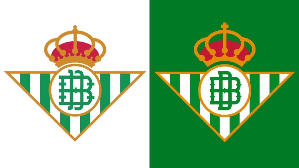
First of all, Betis’ crest was redesigned to have simpler elements. Thus, the crown got rid of smaller details which were, according to Accenture, visual noise. The double B was revised as well. The vignette, standing for “Betis Balompié” (the latter word is a literal translation of “football”), now has closed strokes in the longer “B”, the wider “B” has received smaller ticks, and the green color has become deeper. All of this makes the logo more readable, giving a brighter perception.
Although the changes are subtle, they have evoked heated debates among fans. Those who are against the new iteration express their disapproval, using the hashtag #ElEscudoNoSeToca – “The shield is untouchable”.
Another thing disliked by supporters is dropping “Balompié” from the wordmark that is used alongside the emblem. At the same time, the lettering retained the previous version’s font.

As an official press release says, the new branding with “a proper vector construction” is intended to unify and widen the use of the Real Betis brand in all its sub-brands, including its female football and basketball departments. In other words, Real Betis is more than “Balompié”, it is also “Baloncesto” (basketball), “Féminas” (women’s team), “Fondación” and so on.
In addition, the club has stopped using all the secondary versions of the crest, and that decision was made to support the primary logo which will easily be adapted for digital use even in small sizes.


