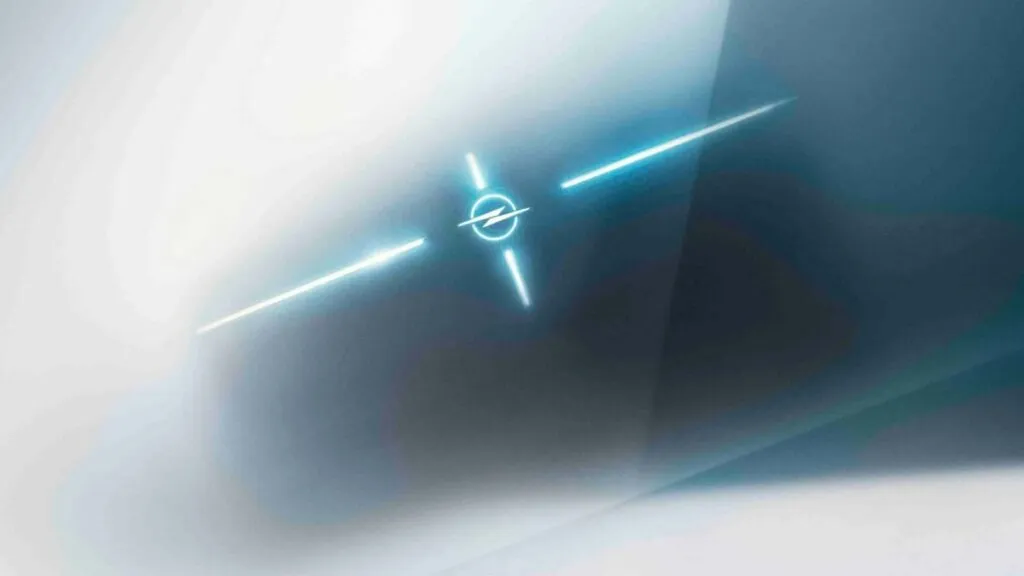
German car brand Opel is on the news again, presenting its modernized logo. Opel’s iconic Blitz, which first appeared in 1963 and has undergone 12 iterations, now represents a dramatic change as it is split in two and will receive a glowing appearance in some of the versions.

According to a statement from the company, the recently presented Blitz is intended to symbolize the era of e-mobility in Opel’s journey. Indeed, we observe a new stage in the 121-year history of the car manufacturer, lately. Five years ago, the company was acquired by PSA-Group from General Motors to become a part of the Stellantis corporation. After a year of financial austerity, it showed profitable results again. Like other car brands of Stellantis, including Citroën, Peugeot, Fiat, and Jeep, the German marque is transitioning to electric technology for its products. By the end of this year, Opel will offer 15 electrified models, and beginning in 2028, the manufacturer’s product range will be made up of electric cars only.

The new Opel logo was presented in an official press release. Although the emblem is already used in digital environments, it will appear on the brand’s cars only in 2024. The new Blitz will also be presented at IAA Mobility 2023 which will take place in Munich in September.
“Our Blitz is most important than ever. It doesn’t only symbolize our pledge to make innovations and mobility available for everyone, but also confirms our aspiration to become an all-electric car brand in Europe. So we can proudly say: Opel is an electric car”, Opel CEO Florian Huettl said.

We can describe Opel’s new logo as refined, cornered, and open. Compared to the previous version, this one shows off a more horizontal extension. The two parts of the lightning bolt break the bordering ring, and the whole figure has the same width as the lettering below. The Opel wordmark itself wasn’t changed. According to the company’s chief design director Mark Adams, the reimagined Blitz emblem corresponds with the “bold and clear” design philosophy which is recently promoted by Opel. The pointed form gives the logo an even more modern look.
Interestingly, the previous time when the company changed its logo as part of a new identity was just three years ago. Opel introduced a new car badge first, which was followed by changing the corporate logo. With the current Opel Blitz, the Rüsselsheim-based manufacturer is carrying out the seventh redesign in 20 years, and no other car brand has experienced revisions so often in such a period of time.


