

Covering nearly 280 sq miles, Norfolk Coast is a so-called area of outstanding natural beauty. Designated for conservation 55 years ago, this protected landscape, located in Norfolk County, Eastern England, includes some sites that are of interest to biologists through its natural reserves. Besides, Norfolk Coast is a popular recreational destination, welcoming four million tourists annually and generating almost £300 million, which makes up a fair share of the local economy. Norfolk Coast Partnership, a managing body for the area, has recently presented a new visual identity for this natural brand, created by London-based design studio Lantern.
![]()
The refreshed Norfolk Coast branding is built around a concept named “Alive with nature” which covers visual and verbal means of communication with visitors. It is assumed that people who will come here will have an opportunity to learn more about how to watch the natural life of this place and carefully interact with living objects in the area. This new program on Norfolk Coast is quite different from what other tourism sites usually offer under simple slogans like “Keep on the path” or “Enjoy, Respect, Protect”.
Back to the point of visual identity, the area’s old logo, in fact, was far from what modern rules of graphic design specify, representing a cute picture that briefly showed what you can find on Norfolk Coast. With its painting-like structure, it was suited more for posters and big billboards.

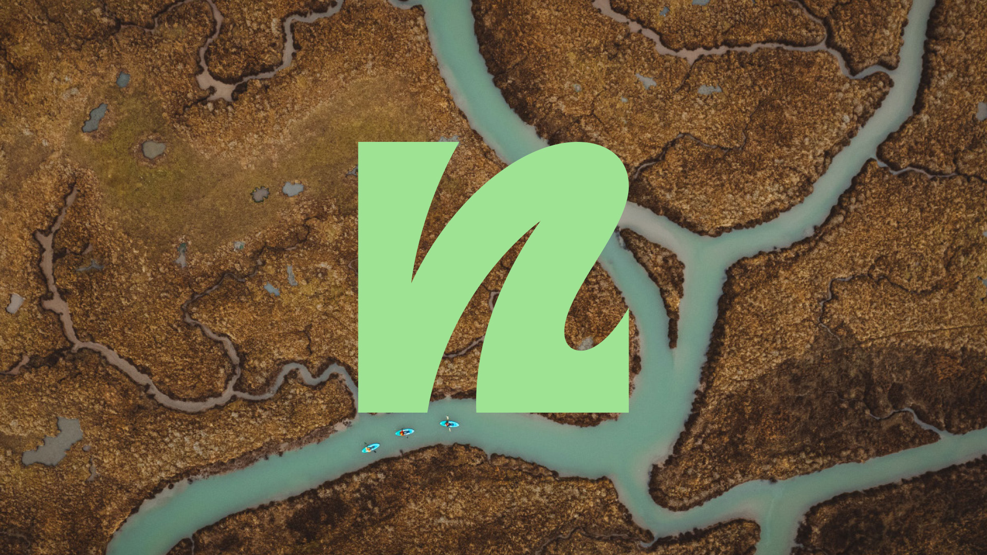
The new emblem, on the contrary, showcases something in line with contemporary design tendencies. According to Lantern, the monogram of a lowercase “n”, which also conceals a “c” in its curve, effectively reflects the essence of the area, having the potential to become a recognizable symbol of Norfolk Coast. Indeed, the icon is rather good to represent the region, as its outline reminds us of the local coastline.
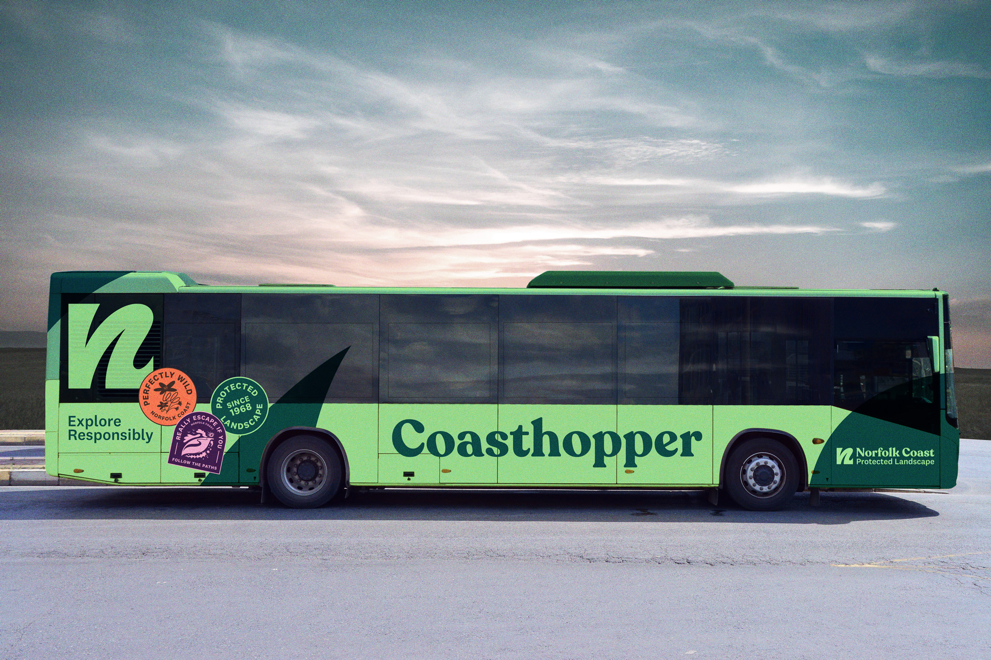
The N monogram is coupled with letterings designed in two different fonts. Thus, the cheerful Recoleta was chosen for “Norfolk Coast”, transferring some of the warm vibes from the previous emblem. It will also be widely used for the brand’s promotional materials. The “Protected Landscape” in the second line is designed in the stricter National typeface. This typographical solution is determined by the length of both lines, demonstrating the visual importance of each lettering and a proper balance between them.
Dark and light shades of green are designated as the main brand colors, highlighting the natural character of the brand. The full color palette also includes a wide range of colors, which symbolizes the versatility of the local flora and fauna. The chromatic abundance can be seen in the additional visuals created by illustrator Benedikt Luft.
In general, the Norfolk Coast identity is rather appropriate, achieving its consistency through the versatility of harmoniously selected visual elements. And this excellently shows the richness of the area.


