Many of the most beautiful landscapes in the United Kingdom are currently protected and supported by the National Association for Areas of Natural Beauty (AONB). The AONB status enables local and national authorities to combat biodiversity loss and, ultimately, global warming.

However, the complex names associated with these protected sites have hindered effective communication. Recent research conducted by the governing organization revealed that only half of the British population is aware of these amazing places, despite two-thirds of them living within a 30-minute distance. In light of this, the association has undertaken a comprehensive design process to update its visual identity.
The first step was to simplify the association’s name in order to enhance understanding and better serve its environmental mission. Henceforth, the AONB network will be managed by the National Landscapes Association, or simply National Landscapes. Additionally, the goal was to unify this network through cohesive storytelling within a single graphic system.

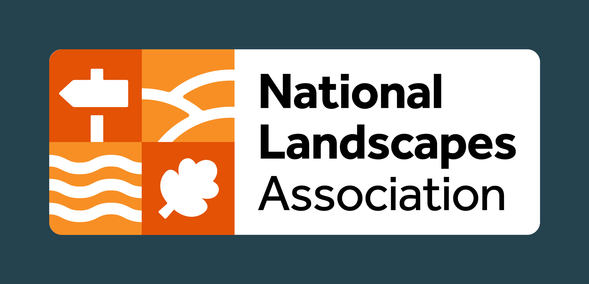
The new logo is significantly simpler, eliminating the excessive typography of the previous design. It now features a plate-like shape that incorporates both an icon and a wordmark. According to National Landscapes, the four sections of the square graphic element symbolize the discovery of natural beauty.
Regarding the wordmark, it is designed in the friendly and rounded Effra sans-serif typeface from Dalton Maag. The sleek letterforms represent the brand’s aspiration for an attractive image. The organization’s name, “National Landscapes,” is emphasized in bold to highlight the shorter name.
The new visual identity is centered around the concept of mosaicity. Each of the 46 AONBs is given the opportunity to showcase its unique characteristics while also demonstrating its connection to the other landscapes.

The idea of the interconnectedness between people and nature is illustrated through a vibrant patchwork of vector illustrations, photographs, and messages against a colorful background. These illustrations are a result of collaboration with stakeholders involved in the management of the protected landscapes. The various visual patches within the graphic system serve as signboards, aligning with the mission of National Landscapes.
The brand launch is accompanied by a video campaign that shares real stories, highlighting the significance of the National Landscapes Association’s purpose. Through these promotional videos, it is hoped that people will gain a better understanding of the natural landscapes of the United Kingdom.


