

The Monterey Bay Aquarium, located in Monterey, California, is one of the leading environmental, educational, and research institutions in the U.S. Opened in 1984 in a former industrial building, the public aquarium is home to a large number of sea creatures, providing its visitors with an amazing and educational experience.
![]()
Apart from showcasing its natural collection, MBA is actively involved in ocean life protection, conducts research in the field of sea biology, and develops educational programs that address environmental issues threatening the ocean. Approaching its 40th anniversary, the institution is currently refreshing its visual identity, collaborating with branding specialists from Pentagram.
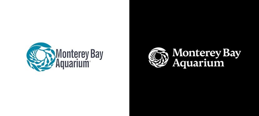
One of the significant features of this place is an astonishing view of a forest of 25 feet high kelps. This forest inspired Richard Graef, one of the first designers of the Aquarium, to create a logo for the institution. Over the years, this “organic” sign has won recognition, strongly associated with MBA. So, the brand has vigorously used the emblem to develop its image.
To effectively communicate to its audience, whether they are families, students, or scientists, the aquarium set the goal to make its visual identity more flexible. For this purpose, the logo design was optimized with a bit rearrange elements. The signature dropped a narrow sans-serif typeface, and given that the wordmark was somewhat dissonant with the icon, it’s a reasonable option. Instead, Pentagram proposed Nocturno that was a bit modified to harmonize with MBA’s kelp ring. The brand’s typography is also supported by the Peak font from Xavier Erni Extraset.
![]()
With the redesign, the aquarium’s logo has turned into a crucial element of a dynamic visual language. Graphically processed, the kelp pattern is used as framing or as design motif for branded visuals and merchandise, developed by illustrator Yehrin Tong. In general, such a system provides consistency and clarity across all the assets of the brand, elevating the kelp symbol in a fresh and unconventional way.
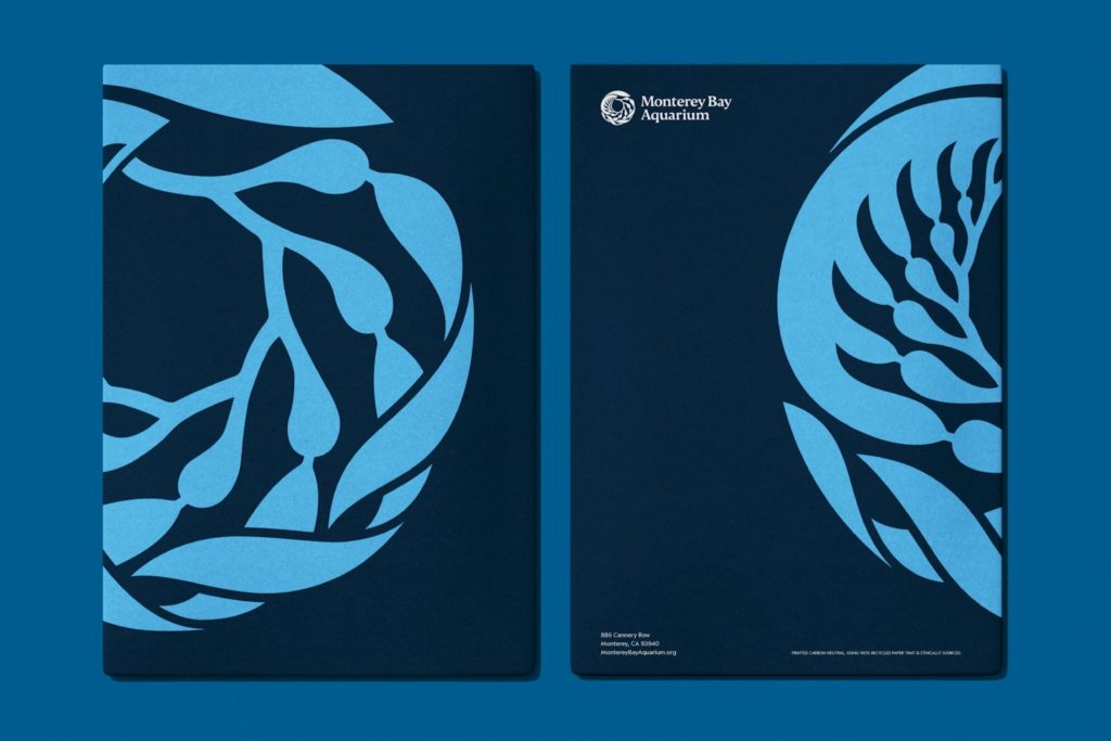
The chosen color palette, dominated by blue tones, livens up MBA’s individuality with rich and bright nuances that are inspired by the attraction’s underwater landscapes with its kelps, algae as well as sea fauna like urchins or octopuses. And finally a series of taglines caps the whole, conveying the feeling of a miracle and admiring the ocean and all its creatures you can see at the Monterey Bay Aquarium.


