

The fashion brand Marc O’Polo was founded 1967 in Stockholm by Swedes Rolf Lind, Göte Huss and US citizen Jerry O’Sheets. For its apparel collections, the label have always preferred natural materials. Since the transfer of its head office to Stephankirchen, Germany, in 1997, Marc O’Polo began an intensive expansion to international markets. While going to celebrate its 55th anniversary next year, the company has revised its logo, colors, typography and marking. The goal of the rebranding is to make the brand more attractive for the customers.
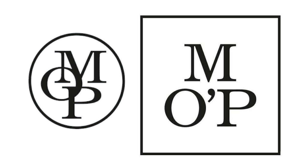
Marc O’Polo’s renovated look was developed by the Munich-based design agency Wiegand von Hartmann. The corporate design will be widely introduced from the 2021 Fall Winter season. While the brand’s new logo still represents a MOP monogram, the letters are separate now, and an apostrophe was added between the “O” and “P”. The square bordering with its straight lines, instead of the previous version’s circle, is a reflection of motifs which is often used in the Scandinavian art. It is to make the emblem more modern, clear and accomplished. The tagline “Est. in Stockholm” will also tell about the Swedish roots of the label.

Apart from this, the new corporate visual identity is intended to emphasize the brand’s steadfast development. The MO’P Grey color scheme includes an additional pastel green shade called “Sustainable Green”, correlating with Marco O’Polo’s new Sustainability Strategy. The secondary colors, like orange or violet, will be used for Sale or Members Sale campaigns.
Marco O’Polo’s new CEO Maximilian Böck has got great plans for the label. He says the company’s goal is to double its sales, positioning the brand in the global scale as it is betting on its base principles – fashion and sustainability.


