

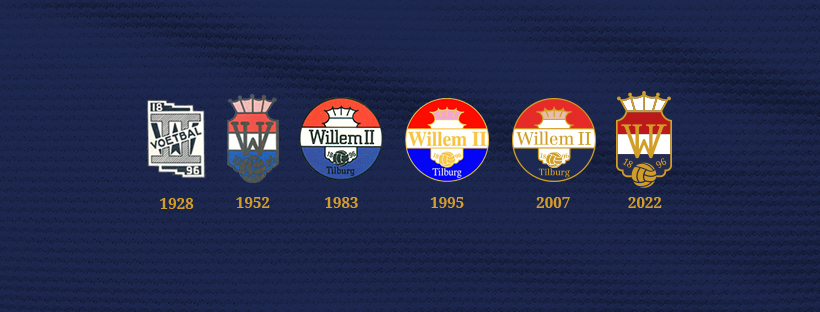
Playing in the Netherlands’ football top division Eredivisie, the Willem II is approaching to its 125th anniversary the club will celebrate next season. On this occasion, the team has updated its logo. The new emblem, which is the sixth iteration in the club’s history, was created, considering the traditional symbolism of Willem II as well as the long-time wishes of fans to return to the logo basics used from 1952 to 1983.
![]()
The traditional colors of the team from Tilburg have always been red, white and blue, accordingly to the Netherlands’ national flag. Based on this fact and the design simplicity principle, the Willem II logo has become smoother, and at the same time, very recognizable, according to an official press release. Named after the Dutch king Willem II, the club has come back to a shield form, replacing its full name with a monogram of a big “W” and “II”. Keeping “1896”, the Willem II pays tribute to its founding year and history.
Explaining the details of the logo, the team said that the WII monogram now has classical serifs, instead of the previous version round ones, corresponding with the typography used in 1896. The crown on the top has received a white coloring, while the football on the bottom has become bigger, with more cornered strokes.
As the Willem II general manager Martin van Geel said, the new logo was inspired by the club’s past. The coming anniversary season and requests from its supporters made the team change and modernize its logo, keeping its symbolism, that was an important thing, too.
The new visual identity of the Willem II will officially be introduced from July 1st, 2022.


