Founded in 2016, Linktree is a web service helping persons and companies easily create a landing page with multiple hyperlinks as an alternative to social media, which rarely allows linking to a lot of sites. Based in Melbourne, Australia, the company, which now has over 24 million users, is aiming to express its evolution through a new visual identity, saying “Linktree stays the same, but with some amusing renovations”.

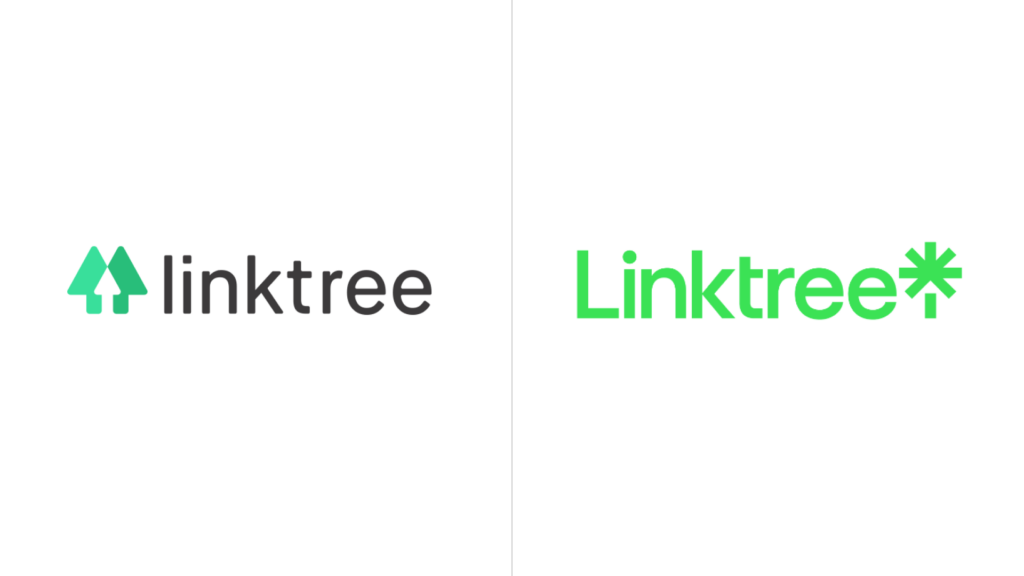
Linktree has unveiled a new logo which, however, is only a surface layer of an interesting rebranding as the brand has entirely been renovated. Having a moving-centered visual language, the company’s updated look is flexible and adaptable, and that can be seen in the whole identity of Linktree, including new typography and a fresh color palette. The rebranding is a result of the collaboration of Linktree’s in-house design team and the New York-based design studio Collins.

Previously, the Linktree logo was composed of a wordmark in black font and a special symbol formed as three arrows or trees in two shades of green, thus reflecting, in a way, the name of the web service. Reworking the branding, the design studio removed this “tree symbol”. However, the new emblem still has an arrow incorporated into a new tree symbol formed by an asterisk and a small vertical stroke below. Although this “tree” is intended to be displayed in black in the base version as a strong typographic symbol, the brand retains green, as a tree motif, but in a brighter hue, making a bolder contrast with the logo.

The visual identity is complemented by a new custom typeface named Link Sans. Considering the worldwide scale of the brand, optimal availability is needed for a large number of languages, and the new typography allows this font to coexist with other scripts with minimal adjustments, that makes it a global typeface, as the company says.


