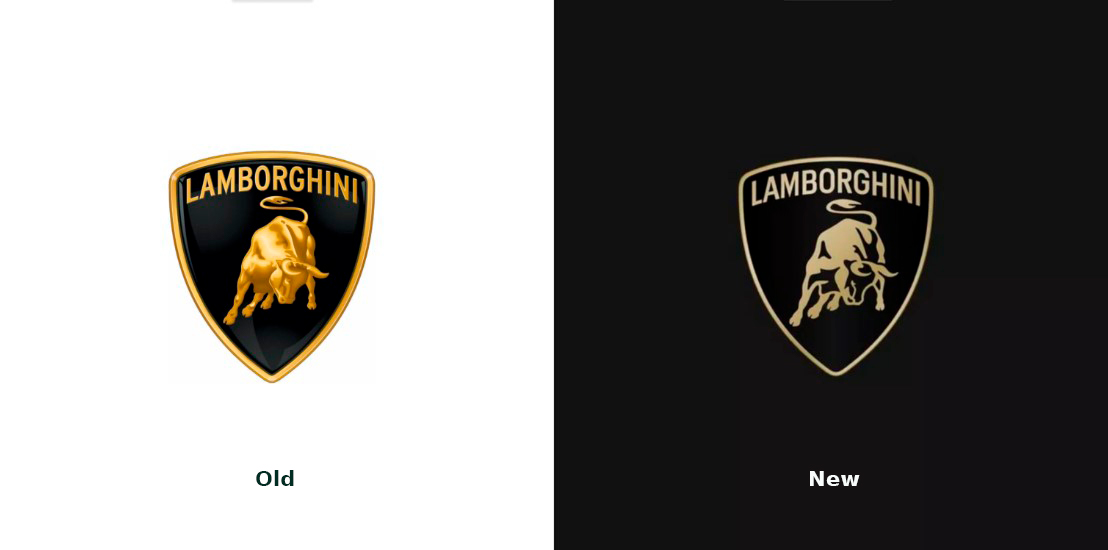
The renowned Italian luxury car brand Lamborghini has updated its logo for the first time in 20 years. Following the current trend among automakers, the new emblem now showcases a flatter and more minimalist design.

The new Lamborghini logo still has a form of a shield, and the general design has remained the same: the brand’s name is still displayed on the top, slightly adjusted for the new version, positioned over the iconic bull in a ready-to-attack posture. However, the change can be seen at first sight, as the shield’s bordering got thinner, and the bull is executed in a more simple manner, with fewer details.
The fresh design also features custom typography, while the gold color is less intensive now, closer to silver. According to an official explanation from Lamborghini, “white and black are confirmed as the main colors, symbolizing the clear individuality of the brand, and gold and yellow will be used as accenting hues”.

The new iteration will be an integral part of the company’s identity, and of course, it is going to be applied to future Lamborghini cars. Furthermore, the bull, as the brand’s symbol, is designated to appear independently, out of the shield, in different touchpoints of the brand. Such use, as the company says, will give it greater importance.
Other assets of the brand deserve attention as well. In fact, Lamborghini has, for the first time, received an official typeface called Automobili Lamborghini, which is distinguished by flawless lines and corners and inspired by luxury vehicles of the automotive marque from Sant’Agata Bolognese. The rebranding also brought a series of icons that was developed by Centro Stile, Lamborghini’s in-house design team.

This evolution of the logo is actually a part of the brand’s ongoing transformation dubbed Direzione Cor Tauri. Lamborghini’s new direction is oriented towards a sustainable development and decarbonization, aiming to release its first electric vehicle to 2028.
The iconic bull as an emblem of the automaker appeared in 1963, chosen by the brand’s founder Ferrucio Lamborghini, as his zodiac sign was Taurus. The choice was also caused by the fact that Lamborghini was a fan of bullfighting. His passion also influenced the transition from an alfanumeric nomenclature to simple names in 1966, when the manufacturer released the Miura sports coupe, named after a breed of bulls bred at the Miura Fernandez farm Lamborghini visited earlier.

Overall, Lamborghini’s rebranding aligns with contemporary design trends in the automotive industry. The flat design lends itself well to digital platforms, which are crucial for businesses today. While the subdued color palette may not make as strong an impact visually at some points, the black-and-white versions still look quite clearer, suited for web use.


