Founded in 1924, the German fashion house Hugo Boss has visually changed its position corresponding with the company’s new growth strategy announced a few days ago. Both the business group and the Hugo Boss brands have been given a new design.

The Hugo Boss group took the mid-term target announcement as an opportunity to refresh its visual identity. According to the company, it is going to considerably increase sales and the market shares of its strong brands HUGO and BOSS over the next five years, improving the awareness of customers.
“Our goal is to become the world’s leading technological fashion platform”, the Hugo Boss CEO Daniel Grieder said. As a part of the CLAIM 5 growth strategy, the company is planning to double its sales up to four billion euros to 2025.

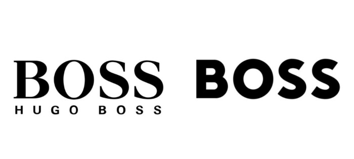
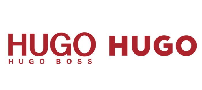
To improve the relevance, the brands BOSS and HUGO have received a new visual identity including logos and a new design concept for retailing and e-business. In the future, customers will learn the two brands in a whole new way. The logo of the corporation has been updated as well.
HUGO and BOSS are only two brand offered by the company since 2017. The BOSS Orange and BOSS Green line-ups were integrated into the main brand for the 2018 Spring Summer collection.
 .
.The emblems of HUGO and BOSS were redesigned in a sans-serif typeface. Both logos dropped the company’s name in the sub-line. While the serif wordmark BOSS, registered in 1987, looks old-fashioned now, the company decided to use sans-serif capital letters, like other fashion brands do. The HUGO wordmark was designed in a sans-serif font before. The two wordmarks are now in the same geometrical font. The color palette stays unchanged: black for BOSS and dark red for HUGO.
So far, the new brand design has already been applied to the Boss Store located in Tokyo’s Ginza district.


