

Acquired by Disney from 20th Century Fox early this year, Fox Broadcasting was renamed Fox Entertainment and announced a rebranding. Gradually changing its identity, the company has recently unveiled a brand evolution.
The rebrand’s visual design process began with a subtle redesign (pictured below) by Trollbäck+Company, a design studio in New York.
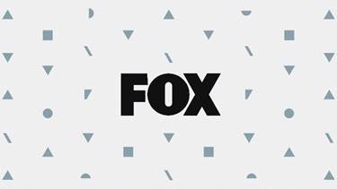
Then Trollbäck+Company also created an abstraction of the FOX logo to create a mark that spoke for the new brand attitude and served as the basis for its entire graphic identity (pictured below).
Reducing down the FOX logo to its core ingredients, then breaking apart the pieces into abstract shapes and patterns was a major component of the visual rebrand. The broken letters offer an infinite number of possibilities for expanding the system: pattern work and creative framing, created from the broken lines of letters and negative space, plays a role in the brand’s iterations across every platform and touchpoint, from billboards to social posts to large-scale, environmental settings.

Nuanced variations in the animated toolkit represent FOX’s new masterbrand in virtually any style or material, from animated and live-action comedy to unscripted series to groundbreaking dramas. Trollbäck+Company also created a digital/social guide and toolkit for the brand that was larger than its on-air guidelines –– another reflection of the brand’s shifting strategy. The new FOX identity is featured across all of FOX’s17 owned-and-operated stations and over 185 affiliate stations across the country, further propelling the rebrand across channels and platforms.
Fox’s new visual symbol looks simple yet unusual, representing geometric figures assembled together to form something reminiscent of the word “FOX”. Such a design will surely make the brand stand out in the streaming entertainment sector. As the designers note, while making the logo, they tried to present Fox as a brand influencing the contemporary culture, forming the picture with individual pieces.
The company’s whole brand set is designed with the same scattered patterns. It will soon be used in ads and on social media, and displayed in all the Fox units including its over one hundred affiliated stations. By renewing its identity, the entertainment company aims to showcase its readiness to cope with risk and swings, and continue developing in the modern broadcasting industry.
Although the rebranding can seem to be disputable, considering that the “F” is shaped unclearly, looking like a “V”, nevertheless, one can’t help admitting that the letterforms is quite imposing, especially drawn in 3D.


