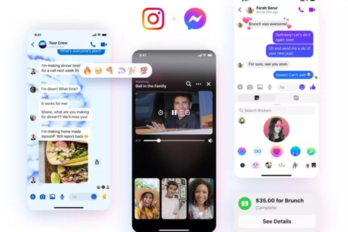
It seems that Google is not alone in trying to unify the brands in terms of visual identity. This idea is likely supported by Facebook that has recently unveiled an updated logo for its Messenger app, as the design of the new emblem resembles the Instagram icon.

While the logo’s general forms, including the central bolt, have remained the same, the change concerns the logo’s coloring. Switching from blue to gradient of blue and pink with some orange hues, the icon really reminds of the colors of the Insta’s camera. Although an announcement from Facebook says nothing about the connection between the two logos, their likeness was noticed by users on social media.
Actually, the consistent logo design for the two services can be connected not only with Facebook’s aspiration for a brand integrity, but also with the fact that the company is about to launch cross-app messaging with Instagram. The upcoming application will allow Messenger users to directly communicate with those who use Instagram. It will also offer some new features including selfie stickers and a vanishing mode which will make messages disappear after the set time period.

While two popular social media are going to be linked with each other via a new technology, it’s not clear yet if Facebook wants to continue the brand unification for its other services including WhatsApp, as it was supposed by some people on the web.
According to Facebook’s officials, Messenger’s new look reflects a step forward to the future of messaging with integrated and a more dynamic contacting between people. All these changes entirely correspond with one of the previous announcements of Mark Zuckerberg when he said that the company would give priority to development of private communication.


