

Mark Zuckerberg’s Meta continues developing the Facebook brand, this time by adjusting the visual design of the social network. The change in colors, signs, as well as the logo,has to “provide a faultless and fresh Facebook”, as a Meta design team posted in the corporate blog. And this is only the first stage of a renovation aiming to create an integrated identity for the whole platform.
![]()
In this first step, the company presented a new version of the Facebook logo, including a redesigned font for the wordmark and a wider color palette that revolves around a fresh shade of blue. The updated branding also includes a new system of icons in larger sizes.
The design of the Facebook brand has been repeatedly reworked. The latest major update, which, among other things, included a new user profile design, took place in 2019 and was codenamed FB5. Now, the redesign comes as part of a further evolution of the brand.
![]()
The logo has undergone minor changes compared to the previous version. It still represents a roundel but showcases a deeper shade of blue and a slightly changed outline of the “f”. These are the brightest differences you can see at first glance.
According to a Facebook press release, the new logo is designed to be “bolder, electric, and everlasting”. The whole design looks harmonious with all those refinements, which are to be key features of the platform’s identity. This was achieved by intensifying the brand blue color, giving more expressiveness and confidence, as well as stronger contrast the “f”.
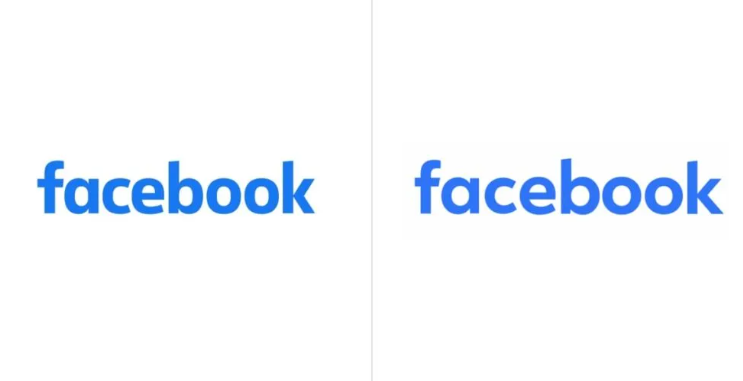
More specifically, the letter got a bit bolder, with wider upper curves. As Facebook design director Dave Nguen says, the design team wanted the logo to look familiar but, at the same time, more dynamic, refined, and elegant. These subtle yet essential changes create a perfect visual balance and a feeling of forward motion.
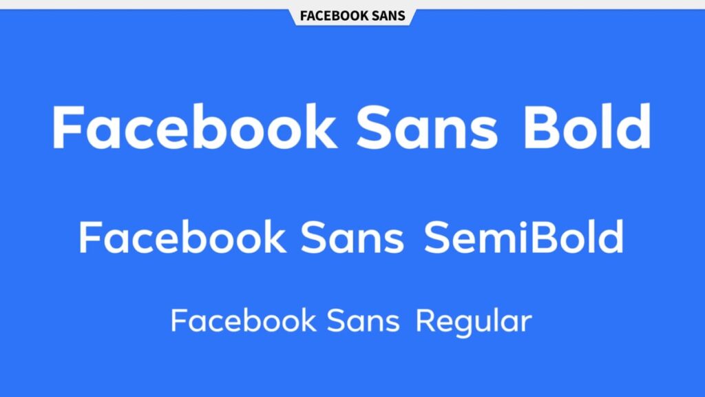
The redesign focuses on the integration of graphic elements and styles. The entire library of icons and smiles was reworked. The company also worked on a new version of the corporate typeface, Facebook Sans. This geometric font has been used in the context of the brand’s communications since 2017. According to the design team, the typeface was refined to improve readability and make it more consistent with the overall visual identity.
In terms of brand communication, the design is quite clean and sharp, which is good evidence of how much attention the company gives to visual identity issues. Some points of Facebook’s branding development have been published on design.facebook.com for three years now. And this is another remarkable thing, speaking of raising awareness about certain aspects of design.


