

Launched in 1994, Eurostar is a pioneer brand involved in international high-speed railway transportation. Its network connects the United Kingdom, France, Belgium, the Netherlands, and more recently Germany. This year, the company is undergoing a rebranding after a merger with Thalys, a high-speed railway provider that connected Paris and Brussels.
![]()
The prominent DesignStudio developed a new look for Eurostar, having made a great job, completely changing the visual identity of the company. The project was based on a new concept named Spark which comes to life under the motto “Spark new experiences” and puts forward a new symbol replacing the dimensional “e” in a sculptural style the company adopted in 2011.
Along with the Spark as a starting point, the project includes an attractive design system helping the brand tell its story about its experience in connecting different places by traveling. And here lies the most interesting thing.
![]()
The creative solution is naturally based on a strategy which, while forming the brand identity, generates new experiences, new ideas, and new opportunities. So the refreshed look is built on a new sign as a guiding star and an icon for the brand.
As DesignStudio explains, the new symbol represents a combination of Eurostar’s “e” and a star, while typography includes custom typefaces giving a nod, with bold and curved letterforms, to the company’s initial identity of 1994.
The Spark as a symbol itself was developed to be a flexible and dynamic element. Its purpose is to create a graphic environment to use for all the activities of the brand – from the design used in trains and stations to digital platforms, including websites, apps, and social media. Furthermore, the Spark supports a wide range of movements and transformations like rotation, stretching, and extruding. In the branded visuals, it acts as a navigational compass guiding the traveler to the destination city.
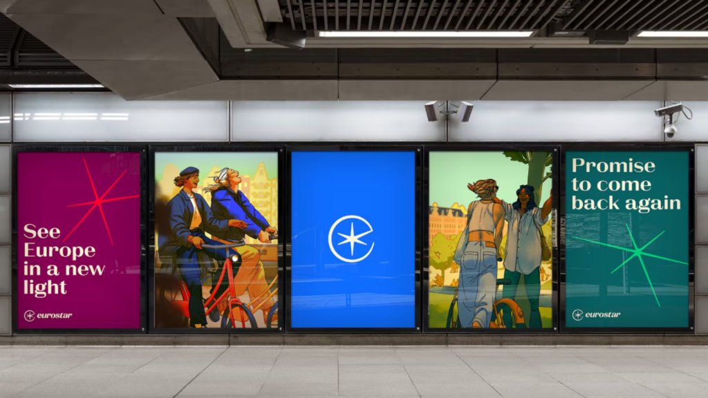
The brand colors of Eurostar and Thalys are modernized as well, with a gamma focusing on a bright shade of blue and deep sea blue. The color palette also includes six secondary colors which, according to DesignStudio, are “inspired by the diversity and vitality of Europe”.
As for the typography details, Eurostar is mainly represented by La Pontaise, a font that gives a perception of elegance and warmth. Additionally, it is complemented with the ABC Social sans typeface visually connected with La Pontaise.
This new system really works, elevating the identity that goes beyond the Eurostar logo, placing emphasis on experience and distinct and consistent storytelling – a proper design language, less cold and more empathic which, at the same time, allows the railway brand to grow and adapt to different contexts.


