

The Edmonton Eskimos, playing in the Canadian Football League, have rebranded as the Edmonton Elks. Renaming themselves, the team meets numerous requests from indigenous people’s organizations arguing that the “Eskimo” has a controversial connotation. Alongside the new name, a new logo has been presented as well.
The rebranding process began last November when then called Eskimos launched an online campaign, asking people to choose a new name for the team. In four months, a list with more than 2000 proposed names was shortened to seven. A final survey among the club’s players, couches, stakeholders and fans, with some advice from experts of the Oxford dictionary, defined the “Elks” as the winner.
It’s noteworthy that Edmonton had a football team with the same name that played from 1910 to 1922. Probably, this fact also influenced the choice of the Elks community.
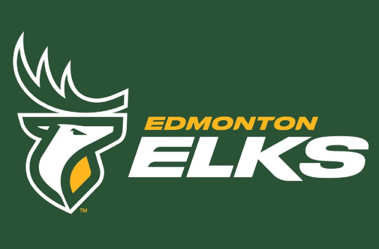
As for the team’s visual identity, it was created by BBD Canada that started from sketches of representational and abstract elks. Finally, the designers and Elks’ representatives settled on a version with an elk drawn with wide strokes. Such a solution favorably distinguished with clearness and simplicity. In a more complicated version, the elk received a white-and-yellow design with a finer drawing of its antler.

At the presentation of the team’s new identity, a huge elk logo was depicted on the field of the Commonwealth Stadium. According to the Elks’ president Chris Presson, it’s been a great process with a result allowing the team to keep their traditional colors, EE initials as well as a part of their old emblem that will be used as a secondary logo.


