

The Japanese game publisher recently present a teaser for Street Fighter 6. Although the developer showed a little of the upcoming game, the fans of the franchise got an opportunity to look closely at its logo. Some of them noticed that it looks like a stock image, and they turned out to be right.
![]()
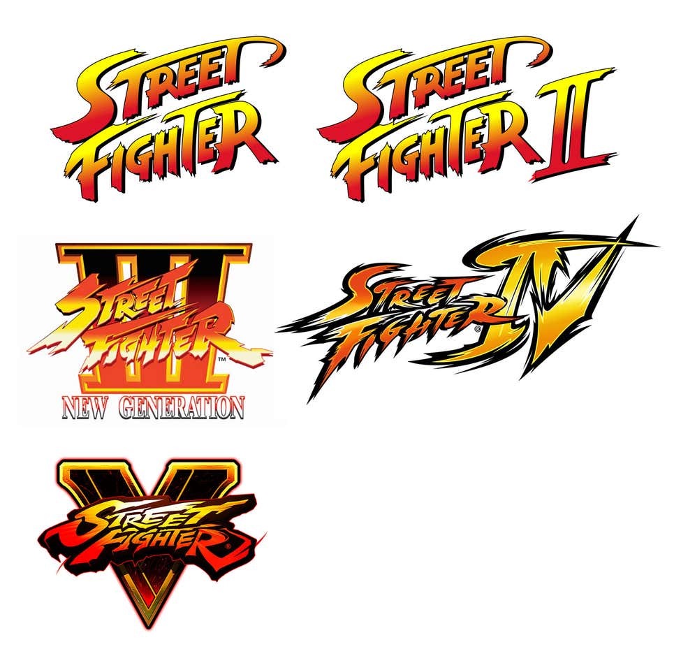
Street Fighter 6 will be the last game of the long-time series which became well-known, including for its logos. They perfectly conveyed the feel of game fightings as well as martial arts movies. They were bright, bold and crazy. However, the latest SF emblem was described as banal and boring by the gaming community. Considering that Capcom has been keeping the style consistency for the franchise’s logos since Street Fighter was launched in 1987, the sixth iteration is, for sure, a departure from the traditions, but in a bad way.
Instead of a combative font, we can see quite generic letters inside a hexagon. The Roman numeral concept was also changed with a simple “6”. The logo was mocked on the web as resembling an emblem of a studio playing a support role on online games.
Indeed, the Street Fighter 6 logo looks like something taken from a stock photo database. Ars Technica’s columnist Aurich Lowson noticed that this consideration has a serious reason as he discovered that a similar SF sign costs $80 on the Adobe Stock website. “They took an ordinary pattern, rounded a couple of corners and added the ‘6’”, Lowson said.
This situation makes us recall the scandal in which Capcom was implicated last year. The company was then accused of stealing a photo made by Judy Jurachek. The photo turned out to be changed for use in Resident Evil 4. That case was settled out of court.


