Capcom is a video game developing company, which was founded in 1979 in Japan. Today the company is one of the most successful game creators in the world with its subsidiaries in Asia, Europe, and North America.
Meaning and history
The company was established in May 1979 under the name I.R.M Corporation in the Matsubara district of Osaka. Initially, the company dealt with slot machines and related games, and already 2 years later its name was known by all Japanese boys. Within three years, I.R.M. Corporation changes its name several times, until someone in management stops at Capcom (short for “CAPsule COMputer”).
Over the next 10 years, the company grows vigorously, opening branches in every city and town in Japan.
In the winter of 1991, Capcom makes the most significant purchase in its history – it acquires YUNIKA Studios, where Shinji Mikami, an unassuming designer at the time, worked. Five years later, this man would create Resident Evil, which brought Capcom worldwide fame.
In addition to developing games for its brands, Capcom has also developed arcade, Dreamcast and PS2 versions of “Mobile Suit Gundam” for Banpresto and is publishing in the Japanese market a host of upcoming games, including the Grand Theft Auto series.
Capcom’s original mascot is Captain Commando, a superhero dressed in futuristic armor. His name is derived from the company name Cap(pitan)Com(mando).
What is Capcom?
Capcom is the name of one of the world’s largest and most famous game developing companies, which was established in Japan in the end of the 1970s. The most famous video games of the studio are Resident Evil, Devil May Cry, Street Fighter, Megaman, Okami, Onimusha, and Marvel vs. Capcom.
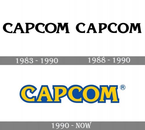
1983 – 1990

True first Capcom logo was a simple black logotype placed on a white background and executed in a custom and chic serif typeface with all uppercase letters written in thick sleek lines with the interesting shape of the contours. The serifs were not long but still visible and distinct, which made the look of the wordmark strong and sharp.
1988 – 1990

In 1988 the second version of the Capcom logotype was introduced. It was the same style of the lettering in a monochrome color palette, but with the letters written in thinner lines, placed a bit farther from each other and the ends of the lines straighter, with geometric cuts of the serifs.
1990 – Today

The Capcom logo is bright and recognizable. It looks a little naive and retro, due to its simple style and color palette, but it is unique and memorable work.
The Capcom nameplate in all the capital letters is executed in a modern serif typeface, which is Korinna. Both letters “C” of the inscription have their upper parts bent to the center, which makes their serifs look sharp and bold.
The bright yellow color of the lettering is balanced by a thick blue outline, which be-comes more intense in the second part of the nameplate, accenting on “Com”.
The yellow and blue color palette of the Capcom logo is a reflection of the energy and creativity of the brand, as well as its progressive and innovative approach to the development of the game.
The simplicity and minimalism of the Capcom logo emphasize the unique style of the company and make it stand out from the list of its competitors.
Font and Color
The heavy and stable lettering from the primary Capcom badge is set in the uppercase of a modern sans-serif typeface, which looks progressive and stylish. The closest fonts to the one, used in this insignia, are Korinth Serial ExtraBold, or ITC Korinna Heavy.
As for the color palette of the Capcom visual identity, it is composed of bright shades of blue and yellow, which stand for professionalism and energy, for stability and progressiveness. These two shades create a perfect image, representing the essence of the company and it’s approach.


