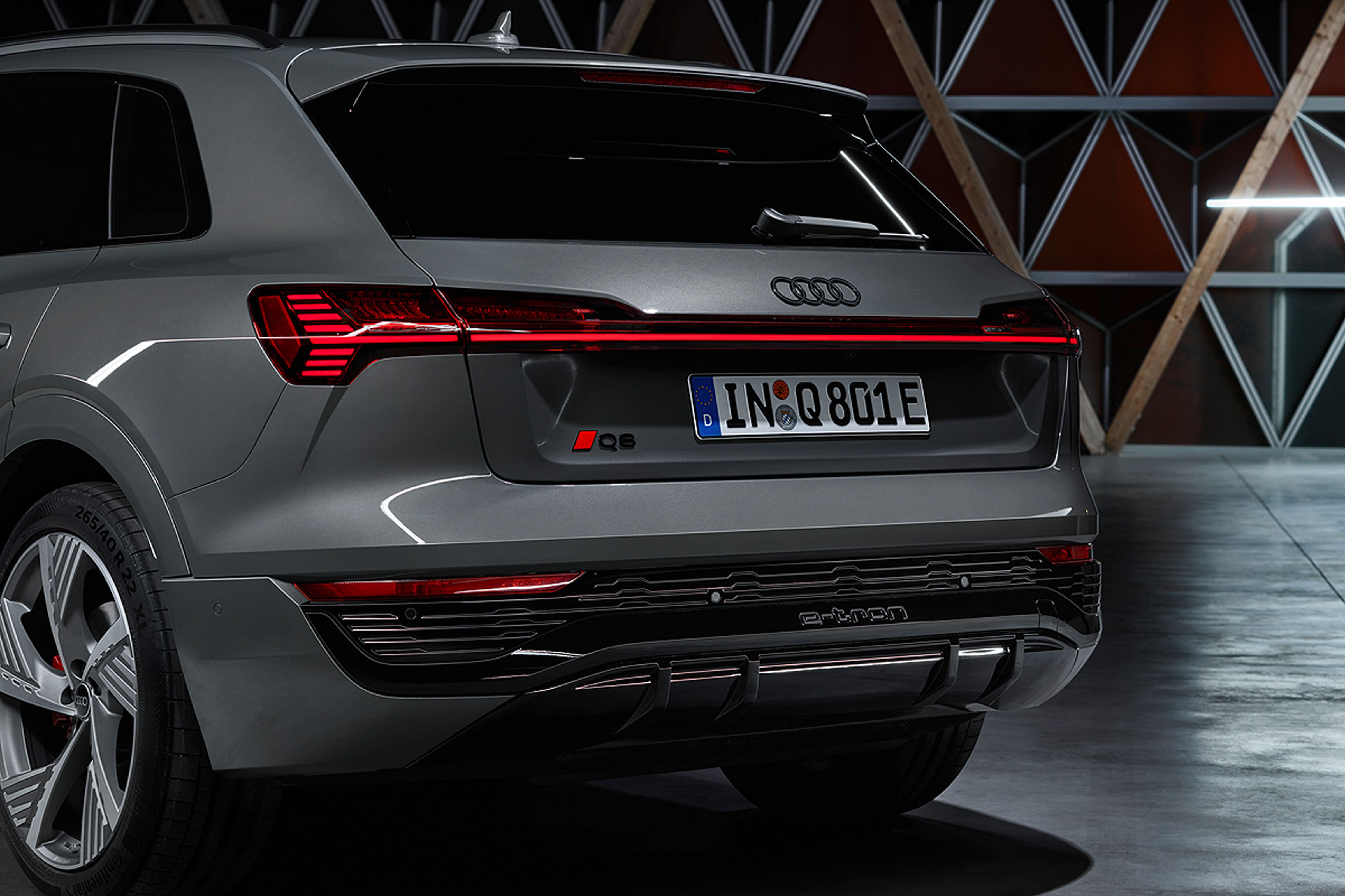
The Audi models are going to carry a new logo in the future. The iconic four rings stay, but with a more puristic look, adapted to the brand’s new design.

Back in 2020, the German car maker introduced a new corporate identity. Now, the Ingolstadt-based brand is adjusting its trademark to its new-gen vehicles, designing the four rings logo in a stricter style. While the Audi 3D chromed car logo will soon become history, the brand is transiting to a flat emblem. The rings are now executed in white, and each of them is framed in a thin black bordering.
Additionally, a black version will be provided, with the inner edges of the rings colored in dark gray. In general, this logo has to have a stylish glossy look. According to the manufacturer, this solution is realized to avoid a boring and banal design.
It is also reported that the designers didn’t change the proportions of the emblem, but the contrasting color palette makes it more remarkable. The brand calls this color combination “new chrome”, saying the black-and-white rings are perceived as premium and look equally good on cars of any color. The black version is planned to use in a black exterior finish, though.
The new logo debuted a week ago, featured on the facelifted Audi Q8 e-tron. The electric crossover is expected to be powered by two electromotors (one on each axis) with a total capacity of 300 kW (408 hp). Such specs will give it a power reserve of more than 300 miles. In terms of logo design, the Q8 will soon be followed by other Audi models.


