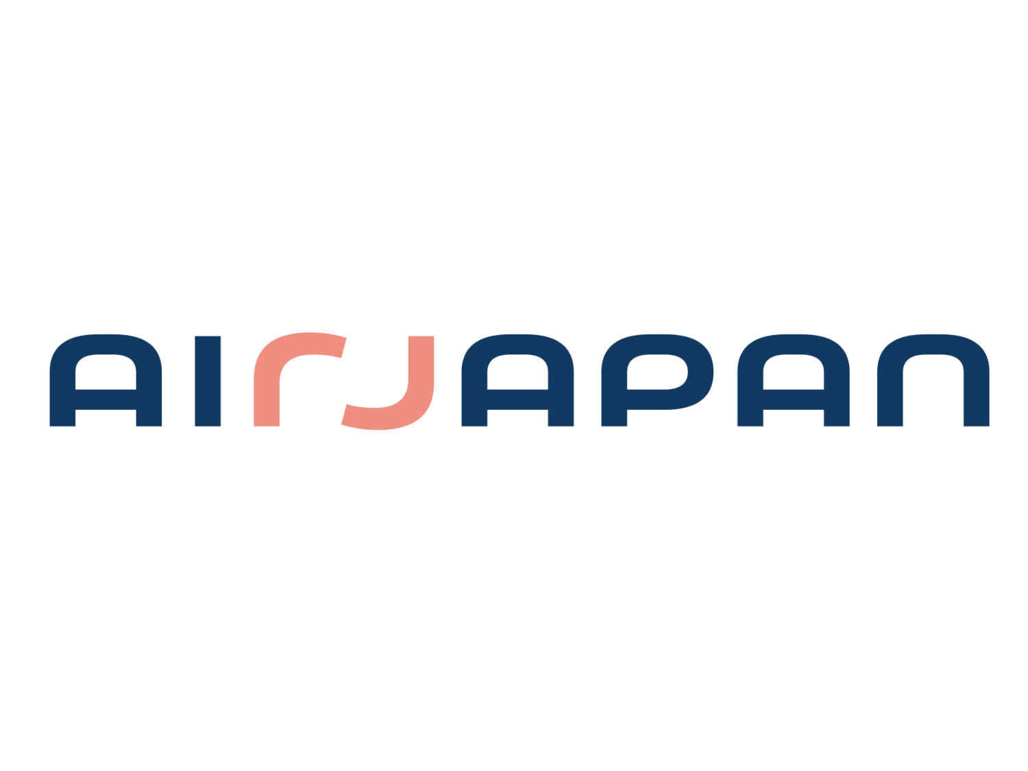
Established as World Air Network in 1990, Air Japan has received a new brand identity as a part of a changed corporate strategy. From now on, the airline will position itself as a friendly and careful company that has to be expressed by the brand’s new logo and Fly Thoughtful statement.

In October 2020, ANA Holdings, the parent company of Air Japan, announced a total reorganization of the airline, urged by the financial crisis after the COVID-19 pandemic broke out. Until recently, Air Japan was hardly known as a brand. Now, the situation is going to be changed. The first flight under the new visual identity is planned for the second half of 2023.
The airline takes a strategic position between the low-budget Peach air company and the premium Air Nippon Airways – both of them are subsidiaries of ANA Holdings as well – in terms of prices and services. According to ANA Holdings, Air Japan’s brand, created, among other things, for international average distance routes, will make an entirely new type of air transportation.

The rebranding’s goal was to create something between a full-service and a low-cost carrier that would combine the best of both types, providing quality and ideas in a Japanese style. This has to be mirrored in the airline’s new slogan “Fly Thoughtful”.
Based on this philosophy, the company worked out a brand design that is intended to convey “Air Japan’s thoughtful and gentle approach”. The logo, colors and the plane design were purposely created to be in accordance with this principle of the brand.
The company explained the brand’s color palette, saying the indigo blue (“ai iro”) reflects the Japanese traditional craftsmanship and technique of dying in indigo blue that is a complicated process requiring thoughtfulness of the craftsman, while the light shade of red (“akebono”) was inspired by sunrise and the springtime in Japan, meaning “nice warmth and our commitment to comfort and carefulness”.

The brand logo features “Air Japan” with “r” and “j” highlighted in light red, reminding holding hands. The “rj” design, as a visual metaphor, also appears independently on the vertical stabilizers of Air Japan’s airplanes. Commenting on the design, the company says: “In a truly Japanese spirit, we believe that values go hand in hand.
Air Japan’s new visual identity was created in cooperation with the design agency group Landor & Fitch.


