

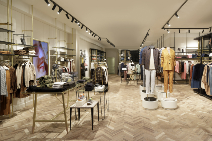
Founded in 1985, the Dutch fashion brand Scotch & Soda is betting on its brand-new design and refurbishment concept for its stores, as a part of its new expansion strategy. The facades of some Scotch & Soda boutiques have already been decorated with the label’s remastered logo.
![]()
The first sketches of the company’s new logo were presented last spring. Now, when Scotch & Soda is adding new stores to its over 200 facilities across the world, the brand’s facelifted look is more visible. The fashion label’s collection includes men’s, women’s and children’s clothing as well as sun glasses, fragrance and accessories.
The new store design named “Free Spirit” was launched back in March. Inspired by the power of self-development and Amsterdam’s libertarian spirit, the concept combines warm colors and fine design features, allowing to bring together the known and unknown, as the company’s press-release says. Inside, the design is complemented by such sustainable elements as LED-lights, FSC-certified Hungarian point parquet floor and hangers made of recycled stuff.
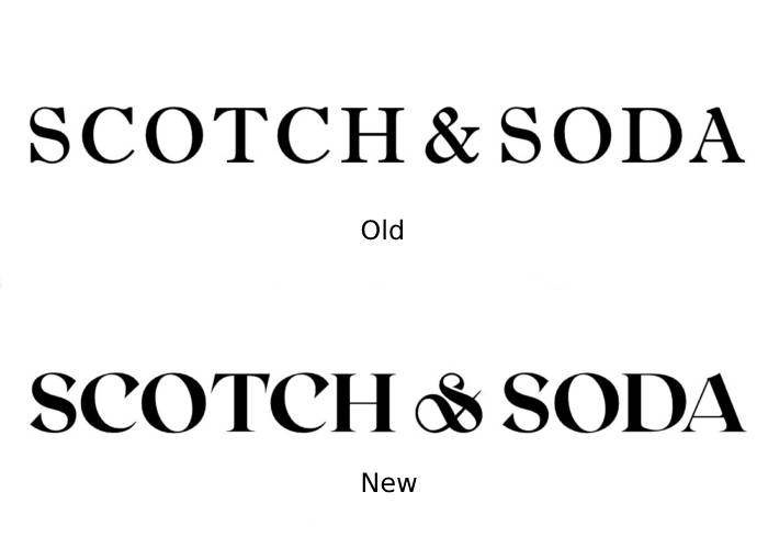
As a part of the rebranding, the Scotch & Soda logo was redesigned in the Roxborough typeface featuring serif letters with sloped ends which are bolder than in the previous version. The wordmark looks in a classic manner, showcasing a calligraphic style, especially due to the ampersand that reminds a thread and an eye of a needle. This can be seen as a nod to the brand’s original emblem which depicted a sewing machine.
Unlike Calvin Klein, Yves Saint Laurent, Burberry and other fashion brands, Scotch & Soda enjoys a typographic independence and demonstrates some refinement of the brand logo. No garish colors that tend to be a kitsch. Instead, the trademark is rather a visual equivalent to the context, expressing materiality, craftsmanship and attention to details.


