

Last week, Air India presented its new visual identity, including a fresh design for its aircraft. The rebranding is connected with the airline’s plans to transform its fleet with 470 new aircraft as part of a multi-billion-dollar contract.
![]()
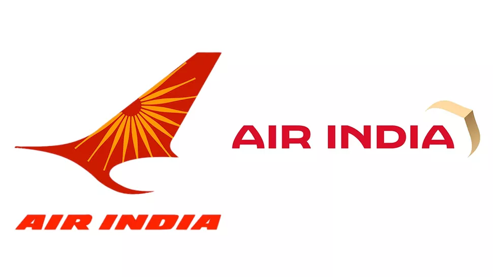
The airline, owned by Tata Group, says that its new logo, called The Vista, “reflects the essence of the bold new India, celebrating the milestone of Vihaan. AI, a five-year strategy to transform Air India into a world-class airline”.
For the new branding, the airline reimagines the traditional design that has been used for windows on Air India aircraft for many years. So the gold “window frame”, as the company calls it, is adopted as the company’s new symbol, alluding to a “Window of Possibilities”, according to an official statement.
Air India’s totally new aircraft livery is distinguished by a palette of dark red (inherited from the previous branding), purple, and gold shades, as well as motifs inspired by the Konark Chakra, an ancient Indian symbol that was included in the company’s old visual identity. The branding also includes a custom all-caps typeface named Air India Sans which “combines warmth and confidence to position the airline as premium, inclusive, and affordable”. It is used for the Air India nameplate, which will look bold and great on the fuselages.
As Air India CEO Campbell Wilson said, the new, transforming brand identity reflects the company’s commitment to make Air India a global airline that serves passengers across the world and represents a new India on the global stage. The new brand system was developed by the design studio FutureBrand and, according to Wilson, unites Air India’s glorious history and aspiration for innovation and perfection.

Although the airline’s new symbol is hard to identify as a window frame, the reference is made clearer in an Air India promo video. Nevertheless, it can still be confusing for some people. Some critical remarks appeared on Twitter, where users called the design banal and plain. There are also more reasoned comments pointing out that the typeface, which apparently refers to “jharokhas”, traditional Indian stone windows, looks outdated, while the colors, albeit corresponding to the Indian artistic traditions, are selected without special efforts or imagination.
However, the new branding has received positive reviews too. Those who like it appreciated its cleanness and simplicity. Anyway, such a turn in design is truly remarkable as it breaks cliches and offers a fresh vision of logo design, built on a rather interesting concept.


