Today, amid the neuronal networks boom, there are more and more companies using AI technology. One of them is Perplexity, which offers a chatbot and a search machine, based on algorithms for natural languages.
Launched just last year by experienced specialists who worked at IT giants like Meta and OpenAI, the service already has two million visitors monthly, and its valuation has grown to more than $25 million. Reaching those high rates, the company has updated its visual identity, assisted by Smith & Diction, a design agency from Philadelphia.

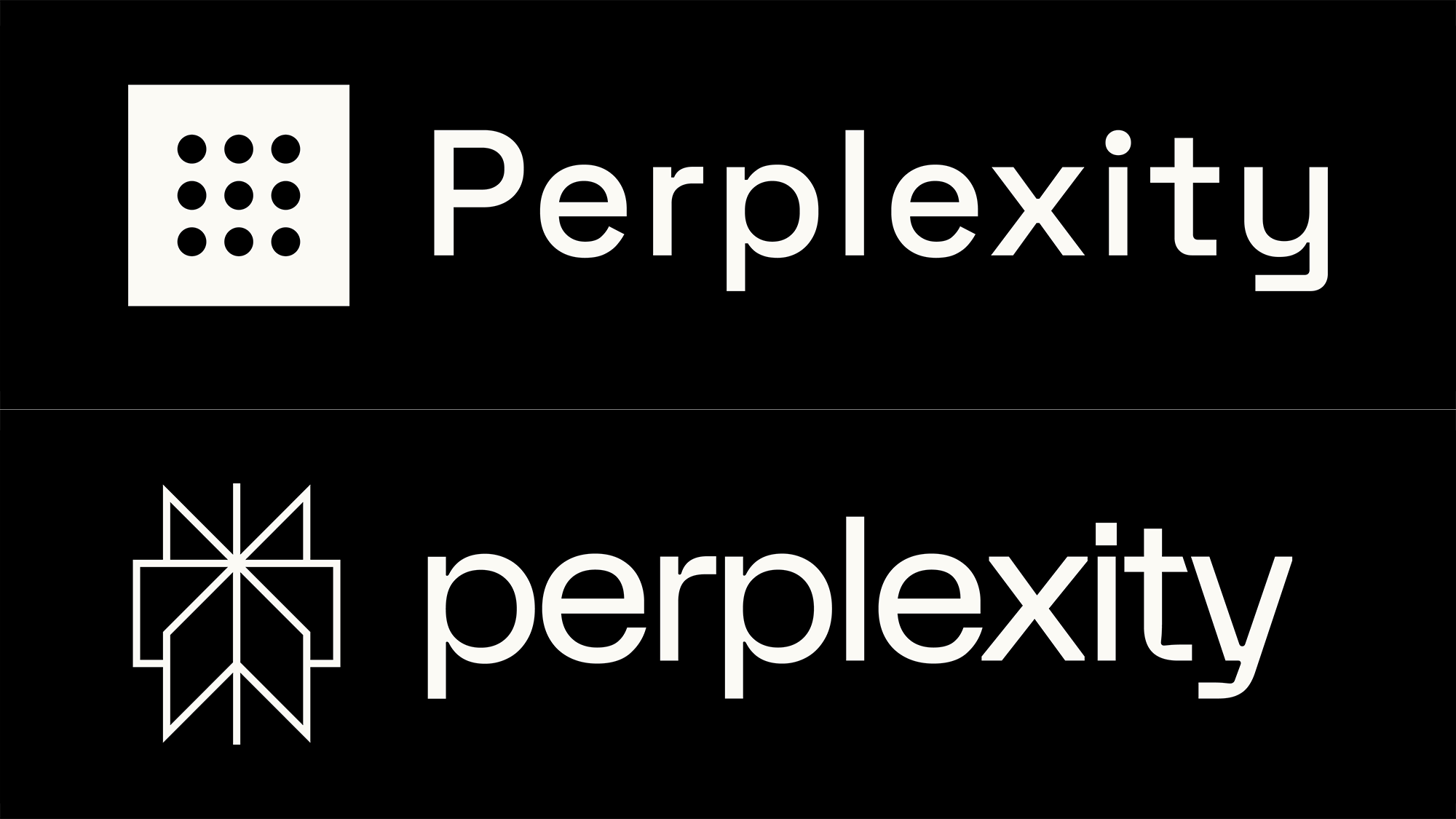
According to the agency, the Perplexity project was complicated yet interesting, as it seemed as if they changed everything, changing, ironically, nothing. In fact, the starting task was to create a new symbol, and it should at least be as simple as the old Perplexity icon. Plus, it would be great to add some deeper meaning to it. The inspiration came from the asterisk, a character that is frequently used by the service to mark the footnotes pointing to the sources of information for its compiled texts. By making this sign dimensional, the designers created a symbol reminding a revolving door.

Furthermore, the new icon reveals an image of an open book, and thus, it receives an additional meaning, standing for learning something new or getting information. As it can be presented as a unit of intersected frames or windows, the sign also symbolizes a multitude of web pages on the Internet, of which you get what you need thanks to the perplexity method.
Having finished with the icon, Smith & Diction got down to the wordmark. After suggesting several fonts that would look something special, the team settled on FK Display, finding that some of its glyphs fit the symbol well. Thus, the “x” perfectly corresponds with the icon, and similar connections and intersections can be found in the “p”, “t”, and “y”. The all-lowercase design was chosen considering the fact that people usually type in lowercase letters when they search something on the web, so it’s a subtle reference to Perplexity’s search engine.

The branding also includes another Florian Kasten typeface, FK Grotesk. The typographical variability is reinforced by a well-chosen color palette that revolves around shades of blue with the addition of some earthy tones.
While Perplexity’s new logo continues the minimalist style, the visual identity is refreshed with the distinct icon that can be interpreted in different ways. Whatever meaning you choose, it will relate to a certain aspect of the company.


