Netscape is the name of a computer company, which was established in 1994 in the United States and shut down in 2003. The company was famous for designing one of the first web browsers.
Meaning and history
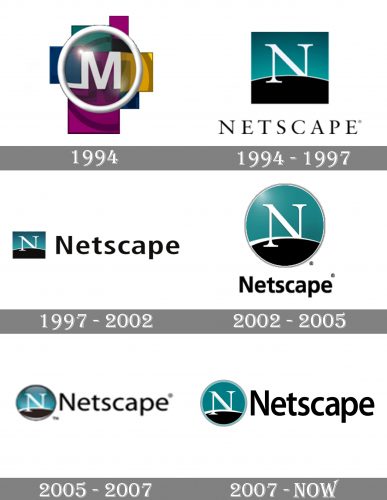
 The Netscape logo was created in 1994 and only slightly modified throughout the years. Once found the perfect image, the company decided not to go for a global rebranding, and made the right choice, as the Netscape visual identity always looks modern and actual.
1994

The initial Netscape logo featured a bright three-dimensional emblem with the white letters “M” set behind a magnifying glass in the white circular framing. The geometric background of the badge consisted of purple, yellow, and emerald shades, which evoked a sense of professionalism and reliability.
1994 – 1997

In a few months, the logo was redesigned into something we still can see today. The stylized white letter “N” was placed on a blue and black square with the arched horizon line, having it left vertical bar “stepping out” of the horizon.
1997 – 2002

In 1997 the emblem got complemented by a bold black wordmark in the title case of a modern yet simple sans-serif typeface with smooth thick lines of the letters. The letters were placed pretty far from each other, making the solid and stable combination look fresh and progressive.
2002 – 2005

In 2002 the square emblem changed its shape to a circle and some gradient shades were added to its surface, making the badge look glossy and voluminous. As for the lettering, it was now set under the graphical part and the typeface became even bolder and more confident. The letters fir placed closed to each other, representing the stability and responsibility of the brand.
2005 – 2007

The redesign of 2005 kept the circular shape of the emblem but refined and strengthened its contours. The circular badge was now placed on the left from the black sans-serif inscription, which got its typeface switched to a lighter and wider one. The logo started looking more balanced, airy, and professional.
2007 – Today
The Netscape logo is composed of a wordmark and an emblem on its left. The lettering is executed in a bold and narrowed sans-serif typeface, which looks solid and confident. The black color of the inscription harmonized the tricolor emblem of the company.
The Netscape emblem is a circle with a thin light turquoise outline. The background of the emblem consists of two colors — sea-blue and black, divided by a white smooth line representing the horizon. The white letter “N” in an elegant serif typeface is placed in the middle of the circle, with its right bottom part hidden beyond the horizon.
The sea-blue black and white color palette of the Netscape visual identity represents a strong and confident company, evoking a sense of trustworthiness and professionalism. It shows the company’s values of quality and innovations as well as its progressive approach and strong connection with its roots and legacy.


