Neteller is an electronic payment system that allows its clients to make money transfers online around the world. It was founded in 1999 and from the outset started to develop very quickly. In 2004, shares of the system were placed on the London stock exchange, resulting in an investment of US $70 million. The owner of the system is currently PaysafeGroup. Having acquired the Skrill payment system in the third quarter of 2015, Neteller has become one of the largest players in the global market of electronic payment systems.
Brand Overview
Neteller is a company, providing online money transfer services, which also allows customers to deposit and withdraw money from bookmakers. The service is incredibly popular along with online gamblers across the globe as it has a lot of benefits in comparison with its competitors.
The company also offers various solutions for e-commerce businesses and individuals in terms of online payment and money transfer and is considered to be one of the world’s safest businesses in this segment.
The company releases prepaid debit cards and (MasterCard or Discover) and has no annual fees for its clients. Another feature of the service is that it allows withdrawing big amounts of money in different currencies.
One of the most popular e-wallets across the world, Neteller aims to make its customers’ payment fast and safe and keeps regularly providing them with innovative solutions.
Meaning and history

The visual identity of the online payment system is minimalist yet bright and striking. The logo is composed of a bold modern wordmark in a bright color combination.
The green and white color palette of the Neteller visual identity is a reflection of a young and energetic company, whose main features are professionalism and reliability. Green is a commonly known symbol of growth and a new life. But it also represents wealth and success, which is the main essence of the famous digital platform.
White adds a sense of loyalty and purity, showing the customer and his protection as the main value of the company and its interests. The simplicity and thickness of the lines in the e-wallet badge show the reliability and confidence of the service, along with its seriousness and fundamental approach.
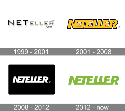
1999 – 2001

The original logo was an inscription ‘Neteller.com’, written in three different styles and two lines. Most letters, besides the domain bit, were capitalized. The ‘Net’ piece was written in bigger, black letters, while the other part of the name proper was in green smaller letters. The domain bit was written below the right tip of the wordmark in small elegant characters.
2001 – 2008

The updated logo also depicts the company’s name, although in a new way. It now uses a single, continuous style. The letters are bold, angular, fully capitalized and tilted. Many of them are merged into a single shape. It’s colored yellow with a black rim along its borders.
2008 – 2012

In 2008, they took that same shape and placed it into the center of a black rectangle. The letters were repainted white, but there weren’t many other changes.
2012 – Today

The 2012 logo features the very same wordmark style, except now fully colored in lime. There aren’t any other colors, and the appearance is identical.
Font
The wordmark of the minimalist logo is executed in a bold italicized sans-serif typeface and is written in all capitals. All the letters are connected between each other on its bottom line, creating a sense of a thick white underline.
Merge font of the nameplate is pretty close to the Lexis Alt Black Italic, which is a strong and modern geometric typeface with solid and confident lines.
Color
This brand’s main color has been a lime green shade for several years. The other common colors include grey and, earlier, black.


