Nelvana Enterprises, Inc. is an animation studio and children’s media company. It is headquartered in Toronto, Ontario, Canada. Its parent company is Corus Entertainment.
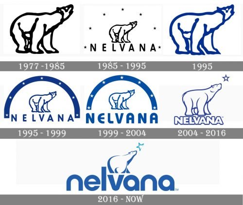
While the Nelvana logo has been updated more than seven times, it has always preserved its core: a polar bear looking up.
Meaning and history
Nelvana is a Canadian television production company specializing in children’s programs. The company was founded in 1971 and is officially considered the first major Canadian animation company. Nelvana is part of the Corus Entertainment media group.
The company’s name was inspired by Nelvana of the Northern Lights, a comics character and the first Canadian national superhero, created by Adrian Dingle in the 1940s.The “northern” theme of the company’s name has also been adopted in its emblem, on which a polar bear is looking at Polaris.
What is Nelvana?
Nelvana is the name of an animation studio, which was established in Canada in 1971, and is specialized in the creation of animated content for children and toddlers. The company is owned by Corus Entertainment, a mass media corporation, which owns several entertainment media brands.
1977 – 1985
The original emblem featured nothing but the bear in black and white.
1985 – 1995
Seven stars were added. The stars were arched above the bear.
Below, you could see the word “Nelvana” in a simple yet legible sans serif type. There was generous breathing space between the letters, which made the design look light.
1995 (first version)
Once again, only the bear was left on the logo. It looked pretty much like the original emblem, with the exception of very subtle differences and the blue color.
1995 (second version)
The same year, the brand introduced an updated design. Here, the stars were white. They were placed inside a dark blue arch. In comparison with the 1985 emblem, this one had more weight and looked somewhat more cluttered. Yet, in this case, the stars better merged into the design, while in the 1985 emblem, they somehow fell out of place.
Nevertheless, the stars still were too small, so at a larger distance, they looked like dots making it impossible to understand the meaning of the design.
1999 – 2005
The lettering grew larger, which made it better legible. Also, the type became more rounded. As a result, the glyphs now better fitted the arch above. Also, the color grew somewhat lighter and brighter.
2004 – now
At last, the “star issue” was resolved. Now, there was a single large star (the North Star), so the emblem became easier to grasp.
The letters were heavier than in the previous version. Due to this, they somehow echoed the plump legs of the bear above. The bear, by the way, was redrawn with more attention to detail.
2016 – now
The proportions of the elements forming the Nelvana logo have changed dramatically. Now, the word “Nelvana” dominates the design, while the bear has grown smaller. Both the picture and the type are based on a circle shape. The bear, which has been redrawn from scratch once again, echoes the shape of the glyphs due to the bold strokes.
Font and Color
The bold and stable lowercase lettering from the primary badge of Nelvana is set in a heavy sans-serif typeface with arched contours of the letters, straight cuts of the bars, and extra thick lines. The closest fonts to the one, used in this insignia, are, probably, Nordique Pro Cyrillic Bold, or Zoopla Bold, but with some minor modifications of the characters’ contours.
As for the color palette of the Nelvana visual identity, it is based on a calm and deep shade of medium blue, which looks fresh and clean, evoking a sense of stability and trustworthiness, and showing the company as a reliable and professional one.


