 National Collegiate Athletic Association Logo PNG
Meaning and history
The National Collegiate Athletic Association logo doesn’t give any hint to a specific type of sports. That’s only natural taking into consideration that the organization works with more than 480,000 college student-athletes in a variety of sports.
1910 — 1938

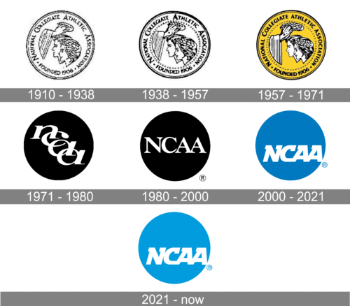
The original badge for the National Collegiate Athletic Association was created in 1910 and stayed untouched for many years, even after the redesign of 1938 not much was changed in it. So the initial design could be seen on the logo of the organization for almost sixty years. It was a coin-like emblem, with the portrait of a young woman and man being crowned with a leaf wreath by two hands from the left part of the medallion. The full inscription was written from the inside of the coin, around its perimeter.
1938 — 1957

The logo was refined and strengthened in 1939. Keeping all elements in their places, the contours of each were emboldened and cleaned. So the faces and letters became more visible and the logo got a more professional look. There was also an outline made up of numerous dots added to the interior part of the coin to separate the graphical part from the text one.
1957 — 1970
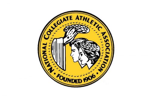
In 1957 the National Collegiate Athletic Association badge gets bright color. The golden-yellow was used for the background of the medallion, with the faces, wreath, and hands still being drawn in white and black. The composition remained absolutely untouched, but the lettering was rewritten in a more modern and bold sans-serif typeface, which elevated the look of the whole badge, making it progressive and stylish.
1971 — 1979

The new visual identity era started for the Association in 1971 when all graphical elements were removed from the badge, and the new minimalistic design was adopted. It was a solid black roundel with a white lowercase lettering on it. The “NCAA” abbreviation was written in the lowercase of an elegant serif typeface, with long curved tails, and placed diagonally, in the bottom right direction, with the letters overlapping each other. It was a pretty simple yet still beautiful and sophisticated logo, which stayed with the Association for almost eight years.
1980 — 2000
The black-and-white color palette from the previous design remained in the new logo, created in 1980. The only difference between the old and new medallions was in the text part — now the “NCAA” abbreviation was written in one horizontal line, in the uppercase of a sleek serif font, with tall letters placed quite close to each other but not overlapping. The black roundel itself was enlarged and became more solid and confident.
2000 — 2021
The redesign of 2002 brought a new refreshing blue and white color palette to the National Collegiate Athletic Association logo. The roundel became solid blue, while the lettering remained white but completely changed its style. Now it was written a bit lower, slanted, and shifted to the right. The typeface was switched to a super modern and massive serif font with only a half of serifs in each letter — in the upper part. The new badge looks much more confident and powerful than all the previous designs and evoked a sense of energy and progress along with stability and strength.
2021 — Today
In 2021, the association slightly modified the look of its emblem. All they have done is introduce a lighter shade of blue. Such a small change created a logo that looked much more pleasant to the eye and had a friendlier appearance. Although there was less contrast between the white lettering and the round base, the letters still stood out and did not get lost.


