

![]() Dora the Explorer Logo PNG
Dora the Explorer Logo PNG
Dora the Explorer is an interactive educational cartoon, which implies the active participation of small viewers in each adventure of the characters and is built on the type of an educational computer game. In each episode, Dora, the main character of the series, invites the audience to go on a hike with her for a specific purpose.
Meaning and history
![]()
A popular educational children’s animated series. The project Dora the Explorer is intended for younger preschoolers and has been aired on Nickelodeon channel for more than ten years. The pilot project was launched in 1999. Each episode of the project lasts 24 minutes. For the first time, Dora the Explorer series appeared on screens in 2000, and the shooting was completed in 2008. A total of 97 episodes were created.
Dora the Explorer is one of those animated series that children are crazy about. After all, it not only entertains but also helps to learn something new and get acquainted with the English language. In each series, our traveler, a seven-year-old American girl Dora, goes on the road to solve an important problem. It can be finding and returning home a lost kitten or helping a mermaid to untangle from the nets. Along the way, Dora and her audience will have to solve several problems and learn new words and expressions in English.
Dora’s adventures are watched by more than half the world, as this animated series is broadcast in 30 languages in more than 150 countries. In almost all of these countries, little Dora helps kids learn English. Young viewers in the USA, Ireland, Serbia, and Turkey are learning Spanish with this cute character.
Dora never travels alone, on the way she is always helped by her faithful friends: cousin Diego, magic Map, Steamroller, Backpack, monkey Slipper, squirrel Tico, iguana Isa, bull Benny, and others. The original Dora is named Marquez. This is not a coincidence, but a reference to the Colombian writer Gabriel Garcia Marquez. The animated series follows the precepts of the novelist’s favorite magic realism. Hence, there is a lot of magic in Dora the Explorer episodes.
What is Dora the Explorer?
Dora the Explorer is a popular worldwide educational animated series adored by many children. Each episode is a short fascinating story filled with simple logical tasks and riddles. The main character, Dora, is a little girl who loves to hike and explore the world. The series started in America in the early 2000s and today is familiar to children all over the world.
In terms of visual identity, is very vivid and colorful, reflecting the intensity of each episode and the happiness and optimism of the main characters. The logo was refined several times throughout the years but stayed more or less the same since 2000.
1999
![]()
The badge, used for the pilot episode of Dora the Explorer in 1999, was set in a green and yellow color palette and had only lettering, placed against a plain white background. The inscription was set in three levels, with the bottom line arched in the shape of a smile. The top level of the badge featured a solid green “Dora” in enlarged capital characters, while the two lower lines were drawn in smaller sizes and used gradient shades.
2000 – 2003
![]()
The first official logo of Dora the Explorer was introduced in 2000 and stayed untouched for three years. First of all, the color palette has been extended. Secondly, the lettering gained a new background — a green leafy bush. The style of the inscription for the two bottom lines was also changed: “the” is now set on a blue arrow, white the “Explorer” uses a sharp sans-serif typeface with flared bars. The Nick Jr. emblem in blue and orange was set in the upper left corner of the composition.
2003 – 2012
![]()
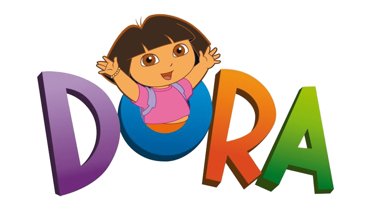
In 2003 the logo of the series was cleaned up and minimized. The green background and additional graphical elements were removed from the composition, leaving just the three lines of the lettering, with the blue arrow in the center, and the intense colors of the characters. The “Dora” part is set in purple, blue, orange, and green, with the middle part in blue and white, and the “Explorer” in playful fuchsia.
2012 – 2015, 2019 – Today
![]()
With the next redesign, the logo of Dora the Explorer gained some volume, with the help of light gradients on the “Dora” part. Another change was made to the font of “The Explorer”, with the white lettering on a blue arrow getting bolder, and the “Explorer” being rewritten in the uppercase of a modern geometric sans-serif typeface with straight contours and cuts of the bars.
2014 – Today (Merchandise)
![]()
Another Dora the Explorer logo was designed exclusively for the Merchandise of the franchise. It looks much more modern and vivid than the primary logo of the series, with lots of gradients and more complicated shapes of the characters. The palette is based on intense and pastel shades of orange, pink, purple, and red, with the turquoise lowercase characters in the tagline. The negative space of the “O” is decorated by a stylized flower, which has each of its petals colored in its shade, supporting the main palette.
Font and color
The lettering in the primary logo of Dora the Explorer uses two different fonts: the “Dora” part is set in a custom sans-serif typeface, while “The Explorer” is executed in a commercial type, called Hypatia Sans Black.
As for the color palette of Dora The Explorer’s visual identity, it is based on bright and intense shades, which stand for activity, energy, education, and fun. The combination of colors in the badge makes the simple clean shapes look delightful and playful.


