What makes the Mugen logo stand out among the majority of logotypes you come across every day is that it is bilingual. You can see the Japanese hieroglyphs to the left and the English version to the right.
Meaning and history
The history of the world-famous brand Mugen began back in 1973 when the eldest son of Honda Corporation founder Soichiro Honda decided to open his own small business in parallel with his studies at university. The company Mugen Motorsports began with a small garage, where Soichiro modified his father’s old cars, repairing them and improving their technical characteristics.
In 1984, Soichiro Honda hired mechanical engineer Takeshi Kubado as his assistant, who brought fresh ideas and modern technical solutions to the young company. Three months later, the Mugen studio presented the first complete aerodynamic package for the Honda Ballade CX, and in 1992 the first fully modified Mugen NSX prototype was shown to the world.
After that, Mugen Motorsports began to actively cooperate with racing teams of different classes, starting with the Japan Li Mans Challenge and ending with the famous Formula 1.
What is Mugen?
Mugen is a tuning atelier that specializes in tuning Honda vehicles and producing tuning components for them. The company was founded in 1973 by the eldest son of Soichiro Honda, the founder of Honda. Despite the kinship of the founders, Mugen Motorsports was an independent company and was never owned by Honda.
1980’s
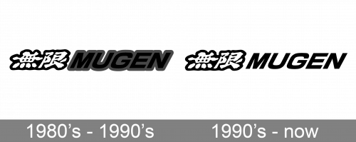
In the 1980s, the primary logo looked pretty much the same as it does today. In print, a distinctive grayish tint of blue was added to the design. Also, in this era, both the Japanese and English versions had shades (in the current logo, only the Japanese version has the shades).
We should also mention the “Mugen Power” logo. Here, the two words in English were given in a completely different type, an italicized lowercase one inspired by handwriting. In between, there were again the Japanese hieroglyphs. This time, they were placed one above the other.
1990’s
Of course, the different languages break the logo into two separate parts. And yet, the design forces behind the brand have made a couple of modifications to make the two parts merge.
To begin with, both of them are tilted to the right. In addition to creating an illusion of the two names being a single whole, this adds a dynamic feel. Also, they are literally very close to each other – the distance between them is not the space between two separate words but rather the distance between two glyphs.
To end up, the two versions of the name are placed inside a single shape, a black rectangle. However, in the case when the logo is black on the white background, the rectangle is often not used.
By the 1990s, the red-gold-black stripes often appeared in print. By the way, the company still uses this color combination as part of its visual brand identity, although it is not included in the official Mugen logo.
Font and Color
The bold italicized lettering from the primary Mugen badge is set in the uppercase of a heavy sans-serif font with the inclination of the letters creating a sense of speed and motion. The closest fonts to the one, used in this insignia, are, probably, Eleusis Italic, or Hype Vol 3 1800 Bold Italic, with some visible modifications of the contours.
As for the color palette of the Mugen visual identity, it is set in black and white, a timeless combination, which stands for the progressiveness, strength, and confidence of the company, and makes its badge look stylish and powerful.


