MorningStar is a Californian agro-industrial and food company. They process 25% of the state’s tomatoes and account for more than 50% of the US industrial tomato paste market. If you have ever been to the United States and eaten something with ketchup there, you have probably already used the company’s products. Morning Star is also known for its no-management philosophy. Instead, employees are encouraged to self-innovate, self-define job responsibilities, and even make decisions about equipment purchases, hiring, etc.
Meaning and History
MorningStar Company was founded by Chris J. Rufer in 1970. The company began to grow. Soon, they built another factory, then another. In 2013, it owned 40% of the country’s market for tomato paste and canned tomatoes. Extending the boundaries of its influence, Morning Star now cooperates with partners across the US without having direct contact with them. Distribution of MorningStar Farms plant products was facilitated by the beginning of a partnership between the brand’s parent company The Kellogg Company and one of the world’s largest transnational corporations Sodexo (France).
What is MorningStar?
This is an American manufacturer of plant-based food products. The company is engaged in the cultivation and processing of tomatoes at three large plants. Preservation of the harvest is carried out according to recipes from consumers. Thanks to holacracy, this agricultural company has become one of the most efficient businesses in the world.
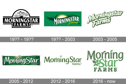
19?? – 19??
The company name was the main element in this logo. It was printed in two lines on a black ornate banner with a white border indented inside. The letters were also printed in white and featured spur serifs that added the inscription a classic look. The logo also had a detailed image of a small farm drawn in a dome shape above the name. It gave an impression that the harvest used in MorningStar products was grown with love and care.
19?? – 2003
A “morning star” replaced the farm image in the logo. The yellow and white sun looked as if it is rising far on the horizon of green fields and hills. The inscription also followed the shape of a hill and was printed using a different serif font of white color. The word “Farms”, though, was done in yellow to go with the sun and featured a cursive style of writing as well as smaller letters.
2003 – 2005
For a couple of years, the company used a logo that had no other elements besides its name. To make it look attractive, the designers used an off-white for the strokes and green for the outline of each letter. They appeared to have some volume, while their placement on a slight diagonal gave the emblem a dynamic appearance.
2005 – 2012
The new logo looked like a more stylish version of the logo with the rising sun. It also had a dark green background with a sunshine gradient at the top. The white elegant lettering was given a shadow, which made it stand out even more. Unlike the previous version, the “Star” portion had the “S” capitalized. The word “Farms” was done in a very small, sans-serif font and placed in the lower right corner.
2012 – 2016
The inscription from the previous logo was slightly modified to give it a more serious look while preserving the stylish appearance of the lettering. It was done in grassy green color and had no background. The word “Farms” was printed using the same font only featuring smaller letters. A unique feature of this logo, which was also seen in the previous version, was a star instead of a dot above the “i”.
2016 – Today
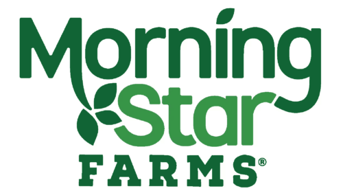
The designers took into account the previous versions to create a new image for the company. They preserved the font used for the “MorningStar” inscription but wrote it in two lines. The top line used a darker green, while the next one was done in bright, light green. They also embellished it with a five-petal green plant or flower that was placed right before the “S”. In addition, a star was replaced by a light green leaf. Finally, the “Farms” portion acquired a more prominent position here as it was no longer tacked in the corner on a second line. They used a bold, slab serif font to create a strong base for the emblem.
Font and Color
The original black and white logo was replaced by a green and white version before the beginning of the new century. Since then, the company changed only the shades of green it used in the logos. Considering the industry MorningStar works in, the color that is associated with nature and growth is more than appropriate. When it comes to fonts, one of the closest fonts for the first two lines in the last logo is Hybi5 Bold by Hybi-Types. The last line is done using a font similar to Nexa Rust Slab Black by Fontfabric. Throughout the years, the company regularly switched between bold, slab serif fonts and more elegant, handwritten style ones.


