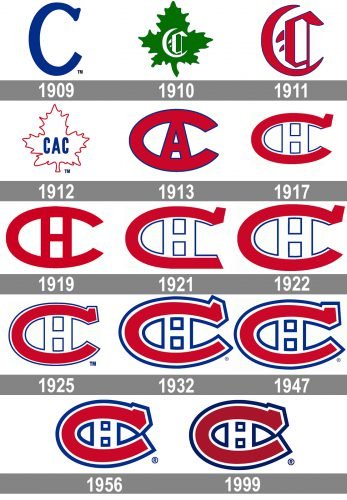
The ice hockey team Montreal Canadiens has been remarkably consistent in its brand identity. Apart from minor updates, the Canadiens logo has preserved basically the same since 1917. Moreover, its core structure can already be seen on the 1910 logo.
Meaning and history
There is barely any hockey club in the world that can compete with Montreal Canadiens in the number of logo redesigns. One of the oldest clubs in North America, Montreal Canadiens changed its logo almost once a year until the 1950s, then the visual identity style was finally chosen.
What is Montreal Canadiens?
Montreal Canadiens is the name of a professional Canadian hockey club, which was established in 1909, and today competes in the National Hockey League as a member of the Eastern Conference. The club has Bell Center arena in Montreal, Quebec, as its home stadium, and Martin St. Louis as the head coach.
1909 — 1910
The very first logo of the hockey club from Montreal featured a very simple and modest composition — it was a bold blue letter “C” on a white background. The upper part of the letter had a delicate smooth serif, while the bottom edge was clean and straight.
1910 — 1911
The redesign of 1910 brought a different image to the club’s visual identity, placing a white gothic-style letter “C” on a maple leaf, executed in a forest-green color, standing for growth, life, and progress.
1911 — 1912
The gothic-style “C” remained the main and only element of the logo created in 1911. It was a red letter with each of the elements outlined in blue. The image was usually placed on a white background, looking elegant and pretty traditional.
1912 — 1913
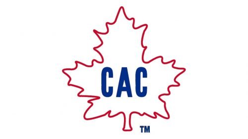
The redesign of 1912 brought the maple leaf back, drawing it in white with a thin red outline this time. The narrowed bold sans- serif “CAC” inscription in blue was the only bright element of the new emblem.
1913 — 1917
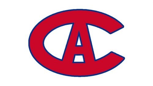
The predecessor of today’s iconic emblem was introduced in 1913 and featured a bold stretched letter “C” in burgundy, with a smaller “A” placed inside it. Both letters marched in one structure and were outline in white and blue.
1917 — 1919
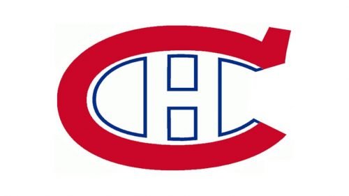
The redesign of 1917 replaced the “A” with the “H”, for “Hockey”, and started drawing it in white with a blue outline, while the “C” gained a square serif on its upper part and switched its color to a lighter red.
1919 — 1921
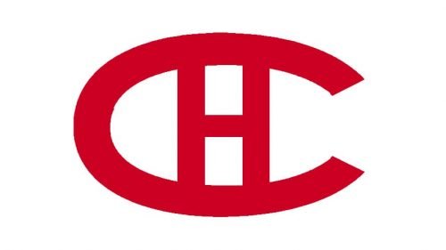
The version of the logo, used by the club since 1919 was the last one, where two letters were executed in one color, burgundy, and featured a common blue outline. It was a delicate and elegant emblem with the narrowed contours of the “H” and thickened, stretched “C”, which added confidence and expertise to the whole look.
1921 — 1922
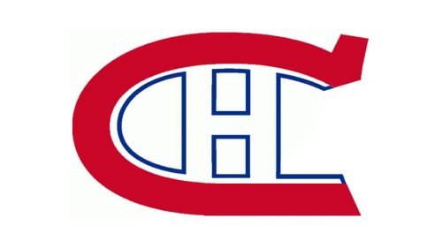
The logo version from 1917 was brought back in 1921 but with some modifications. First of all, the red of the logo became brighter and more energetic, and, secondly, the bottom edge of the “C” was slightly curved down, which made the contour of the letter unique and stylish.
1922 — 1925
The letter was drawn in a traditional shape in 1922, but now its upper serif was a bit enlarged and inclined. The letter “H” became a bit wider and stronger, as for the color palette, it stayed the same.
1925 — 1932
The whole emblem gained a double white and blue outline in 1925, and this made the emblem more balanced and strong, adding more contrast and making the badge stay visible and bright on any background.
1932 — 1947
The emblem was a bit flattened in 1932, and the version of these years became a prototype for the badge we all can see today. The dark red “C” was now stretched horizontally even more, and the white “H” in a blue outline became shorter and wider as well. The blue outline of the emblem became thicker, which elevated the whole logo.
1947 — 1956
With the redesign of 1947, the shape of the upper serif was shanked. The angular fancy element was replaced by a solid square one, which reflected the professionalism and seriousness of the club, pointing to its expertise and authority:
1956 — 1999
The contour of the letter “C” got closed in 1956. Its upper and bottom ends of the line were now touching each other with their angles, making the drop-like spade with the letter “H” smaller than ever. Though all the lines on the emblem became wider and thicker including red “C” and the double white and blue outline.
1999 — Today
The contours of the emblem were slightly refined and the color palette switched to a darker one in 1999. The logo was also used by the club for the anniversary badge, designed in 2009. It was placed on a smooth red ribbon under the blue geometric “100” in a double white and red outline.
Symbol
The 1913/14 season marked the beginning of a completely new era in the logo history. It was then that the large modern red “C” became the core element of the emblem. The letter “A” could be seen inside. The emblem represented the same abbreviation “CAC” as the previous one.
The insignia was revisited in 1918 to reflect the new name of the franchise. The logo meaning was as follows: “Le club de Hockey Canadien.” In the original logo, the “H” was white with the blue outline, but the following year the team adopted an emblem where both the letters were red. This version didn’t last long either, as in 1922, the white “H” with the blue outline reappeared on the emblem.
Throughout the following four decades, the club experimented with the shape of the “C” and the thickness of the outline, until in 1957 it eventually came to the shape that has been used ever since.
Font
While it’s hardly reasonable to discuss the primary logo from the point of view of its typography, we can say a couple of words about the club’s wordmark. The double-lined insignia features a bold sans serif type without any features making it unique. It’s recognizable only due to the team’s icon included in the wordmark.
Taking into consideration that the wordmark is absolutely generic and not overloaded with additional decorative details, we could expect that it would be perfectly legible. But that’s not the case. There seems to be no breathing space for the letters; the glyphs stick to each other. The wordmark has been in use since 1957, which can partly explain these problems. However, the previous wordmark, which was introduced in 1953, is better legible, although it lacks recognizability as there’s no icon.
Colors
The two main colors of the Montreal Canadiends logo are red (PMS 187 C) and blue (PMS 2758 C), while white is used as an additional one. All the three comprise the team’s official palette, which is also used for the wordmark, the kits, and secondary logos. Red, white, and blue have been used, with slight shifts in the shades, since 1911.
RED
PANTONE: PMS 187 C
HEX COLOR: #AF1E2D;
RGB: (175, 30, 45)
CMYK: (0, 85, 72, 35)
BLUE
PANTONE: PMS 2758 C
HEX COLOR: #192168;
RGB: (25, 33, 104)
CMYK: (100, 69, 0, 62)


