Mojang is the name of the Scandinavian video-games creator, which was established in 2009 in Sweden. The company became famous for developing Minecraft, which is considered to be the most popular and best-selling game in the world.
Meaning and history
The history of one of the most popular brands in the history of video games, Minecraft, is inextricably linked to the history of its development company, Mojang. The Swedish company was established in 2009 in Stockholm, by a group of friends, Markus Persson, Karl Manneh, and Jacob Porser.
What is Mojang?
Mojang is a Scandinavian video-game developer, which was founded in Sweden in 2009. The first and best product of the studio is the world’s most famous sandbox video game, Minecraft, which was released in 2011. The founders of Mojang were Markus Persson (a.k.a. NOTCH), Karl Manneh, and Jacob Porser.
The purpose of Mojang’s creation from the beginning was exactly the official edition, support, and development of Minecraft. The game was mainly developed by Markus Persson.
As Minecraft grew in popularity, the demands on its server side grew considerably, as did the need for quick bug fixes and other routine work that didn’t appeal to a game designer as creative as Persson. That’s why at the end of 2011 Markus gave up the post of the game’s lead developer to Jens Bergensten. The number of Minecraft copies sold worldwide by that moment already exceeded 3 million.
Already in 2013 a new game of Mojang, Scrolls, was released. And in 2014, the Swedish studio was bought by the global giant Microsoft for 2,5 billion USD.On the day of the deal, the founder of the studio and father of Minecraft, Markus Persson, left Mojang for good.In the same year, the development of 0x10c was phased out, and another year later the Scrolls update was discontinued.
In 2016, Mojang released a new game, Cobalt Scroller. In 2017, a sequel to that game, Cobalt WASD, was released.And in 2018, the studio re-released its second game, Scrolls, changing its distribution model to free-to-play and changing its name to Caller’s Bane.
From 2019 to 2023 the Swedish video-game development studio has been working on three Minecraft sequels, Minecraft Earth (2019), Minecraft: Dungeons (2020), and Minecraft Legends (2023).
2009 – 2011
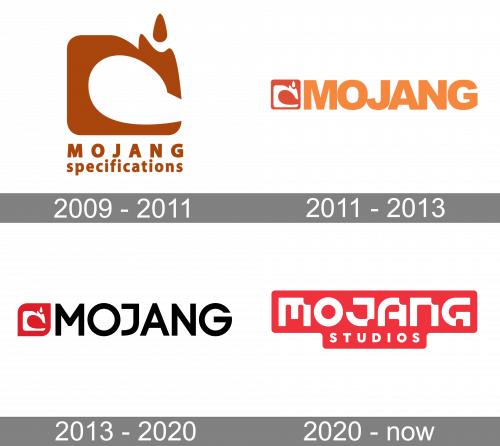
The Mojang logo, introduced in 2009, has stayed with the brand for about two years. It was the very first badge, designed for the Scandinavian studio, it was a bright brown and white composition with a stylized graphical element placed above two-leveled lettering in a bold geometric sans-serif typeface. The emblem on the logo was drawn in a C-shape, with a bent upper right part decorated by a small solid brown drop on top.
2011 – 2013
The redesign of 2011 has switched a color palette of the Mojave logo to a brighter one — with the emblem redrawn in a smaller size, in white, and placed on a solid intense-orange square, set on the right from an enlarged light orange lettering in a heavy geometric sans-serif typeface. The lettering was shortened from “Mojang Specifications” to just “Mojang”, with the characters glued to each other.
2013 – 2020
The name of the company, Mojang, translates from Swedish as “a gadget”. And the brand’s visual identity matches the name’s meaning.
The Mojang logo is composed of a wordmark with an emblem on its left, which is often used on its own, as the brand’s icon.
The Mojang nameplate in all the capitals is executed in a modern sans-serif typeface with clean sleek lines and the straight cut of the letters’ edges. The inscription is well-balanced in terms of line thickness and space and looks powerful and solid.
The Mojang emblem is a red square with its upper left and bottom right corners rounded. The red background of the icon depicts an abstract symbol with a little flame on its top. The company says the image was inspired by a sewing machine silhouette.
The Mojang red black and the white color palette is a traditional symbol of power, reliability and progressive character of the company. This classic tricolor represents a strong and confident brand that values innovations and is passionate about what it does.
The Mojang logo is contemporary and stylish in its minimalism and strict shapes. It looks actual and reflects the brand’s nature.
2020 – Today
The Mojang badge was redesigned again in 2020, with the graphical emblem completely removed, but its color palette became the main. Now the logo featured stylized two-leveled lettering in solid white characters placed over a solid red banner. The upper line of the logo is written in a custom designer font, with the letters looking like pixels. As for the bottom, “Studios”, the level of the inscription, is executed in a more traditional sans-serif font, in a smaller size.
Font and Color
The stylish custom lettering from a primary badge of Mojang Studio is set in a cool geometric designer font with heavy elements of the characters creating a futuristic pattern. The closest fonts to the one, used in this insignia, are, probably, und4 Regular, and VLNL Decks Bold, but with significant modifications of the characters’ contours.
As for the color palette of the Mojang visual identity, it is based on a bright and powerful combination of scarlet-red and white, which stands for energy, motion, dynamics, and strength. The combination of these two shades represents the determination and confidence of the Swedish company, showing it at its best.


