Mofos is the name of a famous erotic video production studio and web portal, which was established in 2008. The studio was established by the famous Brazzers and acquired by MindGeek two years later. The Canadian video producer films not only movies, but also series, and all the content can be watched on their website.
Meaning and history
Mofos is the studio films project with celebrities and have thousands of films released by today. All the content of Mofos is available online, and although you can try to find it on free websites, the whole collection can only be watched on the official platform of the studio, on a subscription basis.
On the Mofos website, you can easily browse all the videos of the studio through a convenient menu or an easy-to-use search engine. The interface of the website is clean and simple, so there won’t be any problems in finding the needed content.
Mofos are experimenting with the content from all sides, starting its themes and plots, and finishing with formats. So the platform is really one of its kind.
What is Mofos?
Mofos is the explicit video production studio, which was founded by Brazzers in 2008, and is owned by MindGeek since 2010. Base in Quebec, Canada, the studio is famous all over the globe, having its movies and series for adults available to watch online through their official platform.
In terms of visual identity, Mofos, a network of amateur websites, is very solid and decent and has a rather heavyweight logo dominated by square shapes. The Mofos badge literally yells “confidence” and “power”, and the traditional black-and-white color palette here looks progressive and bold.
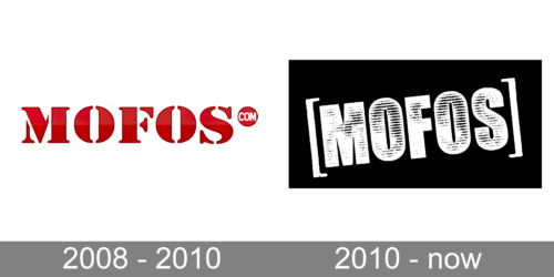
2008 – 2010
The logo, used by the Mofos studio at the end of the 2000s, featured an extra-heavy uppercase lettering in a gradient burgundy, with a thin black contour of the characters. The inscription was set in a bold serif font with quite visible stencils. The bright lettering was usually set on a white background.
2010 – Today
The studio from Canada had its primary logo designed in 2008, and it is still used today, both for the studio itself and for the web-platform, just with slight modifications.
The word “Mofos” on the Mofos Network logo is given in very bold, solid capital letters. They are black with white parts creating an effect of a “worn out” surface. The badge is usually placed on a plain white background, but when there is a need for darker shades, the letters get outlined in white for better visibility.
As for the website logo, it uses the same wordmark but is accompanied by the lettering “.com” in smaller letters, set vertically on its right. At the top, a red rectangle can be seen. The box is the only part of the logo that is neither black nor white. The Mofos Com logo is placed in large square brackets, colored in solid white, and looks bright and fresh.
Font and color
The lettering from the official Mofos logo is set in the uppercase of a stylized sans-serif typeface with massive shapes of the characters. The closest fonts to the one, used in this insignia, are, probably Cocogoose Pro Narrows Letterpress Ultra Compressed, or Headline Gothic ATF Rough No.2.
As for the color palette of the Mofos visual identity, it is based on a combination of black and white, which is a timeless option, working well for brands in any possible sphere.


