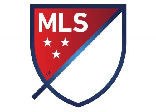
The original MLS logo was subtly modified four times until in 2014 the Major League Soccer adopted a totally new logotype featuring a different color scheme.
Meaning and history
Major League Soccer (MLS) was founded in 1993 as part of the United States’ successful bid to host the 1994 FIFA World Cup. The league began play in 1996 with ten teams and has since expanded to include 28 teams across the United States and Canada. In its early years, MLS faced financial struggles and low viewership, but it gradually established itself through a combination of strategic expansion, the building of soccer-specific stadiums, and the signing of international stars.
Among its main achievements, MLS has notably improved the quality and competitiveness of soccer in North America. It has nurtured domestic talent and made significant contributions to the growth of the sport in the region. The league has also successfully integrated into the global soccer market, attracting renowned players like David Beckham, Thierry Henry, and Zlatan Ibrahimović, which has increased its international profile.
Currently, MLS stands as a prominent soccer league globally, known for its unique structure, competitive balance, and growing fan base. It continues to expand, with plans to increase the number of teams and enhance its competitive stature on the international stage. The league’s commitment to innovation and growth, along with its focus on community engagement and youth development, positions it as a key player in the global soccer landscape.
What is MLS?
Major League Soccer (MLS) is a professional soccer league representing the sport’s highest level in the United States and Canada. It operates as a single entity with team owners holding shares in the league rather than owning individual teams outright. This structure distinguishes MLS from many other soccer leagues globally and plays a pivotal role in its operational and competitive dynamics.
1994 — 1996
 The debut emblem was introduced in 1994. It left no doubt as to what sphere the organization works in. It depicted a black-and-white football and a foot. Under the picture, there was the abbreviation “MLS” in black. Below it, there was the full name of the organization in smaller red letters.
1996 — 2000

The color palette of the MLS logo was changed in 1996. The red and blue were replaced by blue and green, which looked more natural and evokes a sense of professionalism and stability. As for the “Major League Soccer” tagline, it was now written in blue and used a more traditional medium-weight sans-serif typeface, which looked balanced and calm.
2000 — 2012
As the result of the 2000 redesign, the logo was placed inside a black rectangular frame with rounded corners. Both the ball and the foot were modified, and the image grew more vivid and dimensional. The lettering stayed the same as it had been in the previous variation.
In 2008, the Major League Soccer logo was slightly altered. The image remained virtually unchanged, while the text became simpler: only the lettering “MLS” was left. In 2012, the logotype went black-and-white.
2012 — 2015

The redesign of 2012 made the logo monochrome and refined the contours of all elements, enclosing the emblem into a rectangular black frame with rounded angles. The tagline was removed, which made the whole composition look stylish and progressive, even though all elements remained almost unchanged.
2015 — Today

The concept of the MLS logo was completely changed in 2015. The new logo features a classic crest shape, diagonally divided into two parts by a thick blue line. The upper left corner of the badge boasts a sleek gradient red color and has a white sand-serif wordmark set on its top two, and three white five-pointed stars under it. As for the other half of the crest, it is plain white and adds a strong contrast between the red segment and the thick blue outline of the crest.
Font
The simple monolinear sans serif typeface features flattened vertices and slashed terminals.
Color
The color scheme of the current MLS logo is not as diverse as that of its predecessors. In addition to white, it includes several shades of red and blue.


