MG is a UK company, famous for designing and production of sports cars. It was established in 1924 by William Morris. Since 2007, the brand is owned by SAIC, which is one of the largest automobile corporations in China.
Meaning and history
The name of the brand, MG, is derived from the company’s founder’s first business — Morris Garage. The company boasts a rich history, and its visual identity is a reflection of a timeless and elegant approach to vehicle design and manufacturing.
What is MG?
MG is an automobile manufacturer, which was established in the United Kingdom at the beginning of the 1920s. Throughout the years the company has changed its owner around ten times, and today the brand is a part of the Chinese SAIC Motor Corporation Limited.
1924 – 1927
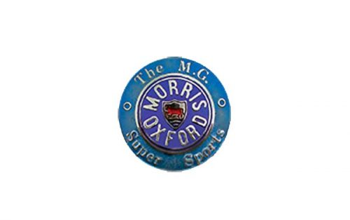
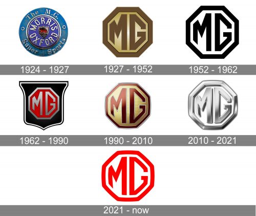
The initial MG badge was different from all the following emblems, created for the automaker throughout its history. The first logo featured a circular shape in two shades of blue, with a classic silver and red crest in the center and two lines of lettering around the crest. The middle lettering, “Morris Oxford”, was written in the uppercase of an elegant and confident sans-serif typeface, while the outer wordmark was set in the title case of a traditional serif font.
1927 – 1952
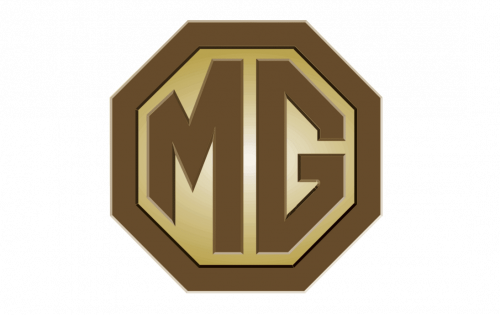
The redesign of 1927 introduced a completely new concept of the MG logo. It was a brown and gold octagon with an “MG” monogram in the middle. The letters featured bars of the same thickness and space as the octagonal framing. They were also set in one shade of brown, a soft and light one, which looked sleek and elegant on a gradient gold background of the geometric badge.
1952 – 1962

All colors and gradients were gone in 1952. This is when MG went minimalist and started using its iconic angular badge in a black-and-white color palette. Flat shapes, sharp corners, and timeless color scheme made the logo look ultramodern and progressive. It also evoked a sense of professionalism and power of the famous automaker.
1962 – 1990
The redesign of 1962 made the badge more complicated and elegant. The octagon switched its color palette to silver and red, became matte and gradient, adding volume to the whole logo. Now it was placed on a glossy solid black crest with a wide flat top part. The crest featured a double white and black outline, which made it possible to place it on any background or bonnet without losing its recognizability and individuality.
1990 – 2010
In 1990 the crest was gone from the logo, and the octagon remained the only geometric figure of the MG badge again. Though this time it became smoother and thicker, gaining come slightly arched lines and a new color palette. The badge resembled the color scheme of the logo from 1927, brown and gold, but both shades were elevated. Also, the letters and framing gained a thin silver outline and a gold background — horizontally striped pattern. The whole badge got glossy gradients and started looking sleek and fancy.
2010 – 2021
The shape of the previous logo remained untouched, while the color palette changed completely — now it was a three-dimensional frame with letters in glossy gradient silver, placed on a white background and accompanied by a modern black logotype in a custom font placed under the emblem.
2021 – Today
The redesign of 2021 simplifies and brightens up the iconic MG logo. The shape and style haven’t changed, but the design of the badge got flat and two-dimensional again. Clean hold lines got their color changed from silver to classic red, which made the whole insignia look more modern and fresh, and started evoking a sense of power and motion, which the previous badges were lacking. The strong contrast between scarlet-red of the letters and framing and the white background makes the logo eye-catching and memorable and allows the badge to be placed on absolutely any surface.
Font and color
The Morris Garages logotype from the 2010 visual identity of the brand is written in the uppercase of a widened custom typeface with medium-thick bars and slightly softened ends of the lines. The font was designed exclusively for the brand but is based on one of the following typefaces: Stereo Gothic 700, Organetto Bold, or Ateros Regular.
The simple yet sophisticated and sleek color palette of the MG logo, composed of silver, black and white, is a reflection of timeless values, quality, and style. It also shows the fundamental approach of the automaker to production and creating the models of the iconic cars.
Which car has the logo of MG?
The MG monogram inscribed into an octagonal frame with slightly arched sides can be seen on the bonnets of the cars, produced by the MG automaker, a brand, owned by one of the largest automobile corporations in China, SAIC. Today the brand mainly produces crossovers.
What is the correct symbol for MG?
The current correct symbol of the MG automaker is a bright red emblem, composed of a heavy uppercase monogram with the name of the brand, written in a modern sans-serif typeface against a transparent background and enclosed into a thick geometric frame in a shape of an octagon with the sides slightly arched from the center, hence the angles a bit softened. The badge can also be seen in black and white, and silver on white.
What is MG the symbol for?
The MG lettering stands for one of the Chinese automaking brands of the same name, which is derived from “Morris Garages”. It is owned by the SAIC corporation and produces passenger cars, including sedans and crossovers. However, if we put the second letter in lowercase, and get “Mg”, it might stand for a chemical element, Magnesium.


