

![]() MetaMask Logo PNG
MetaMask Logo PNG
MetaMask is an Ethereum crypto wallet, launched in 2016. Besides having a connection to Ether blockchain, as well as an ability to keep your ETH coins and other crypto savings, this service has several more functions. Namely, you can access various decentralized apps through this system. They are connected directly to MetaMask, allowing them to work as intended with an immediate link to blockchain.
Meaning and History
![]()
The MetaMask software was developed in 2016 by a group of American programmers. It is one of the more popular Ethereum wallets, but it’s also a platform, through which you can open a variety of apps that work tightly with blockchain and crypto (the so-called dapps). The name essentially means ‘changing mask’ or something of the sort, which relates to the blockchain’s untraceable and secretive nature.
2016 – 2020
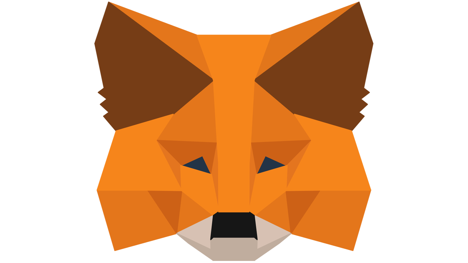
![]()
The emblem of this software depicts a mask in the shape of a fox’s head. It is clearly a mask, because the eyes are empty in many variations. They chose the fox as their mascot for the same reason they chose the name: foxes are secretive, flexible and sneaky. But they didn’t use a realistic design, of course. This mask looks like a collection of polygons with different shades of orange, brown, grey and white. Together, they create an image that looks like a simple 3D model with just a handful of facets.
2020 – now
![]()
The updated logo preserved the brand identity but presented it from a different angle, literally. The fox mask was no longer depicted sideways. It is confidently facing forward and looks very symmetrical. The name also moved and was placed to the right of the mask. It was almost the same height as the mask itself and featured all uppercase, sans-serif letters of a black color. The new logo turned out just as good as the original and the new look turned more head in the direction of this software.
Font
Another image of theirs is a name wordmark, placed either directly below or to the right of the main emblem. It consists of tall, capitalized letters. The letters use a pretty simple sans-serif font without excessive, unnecessary forms or anything really, besides the simple shapes. They are also placed some distance from one another, which creates a wide, tall strip of text.
Color
The emblem uses four main colors, with a variety of shades. There is orange, the most used one. It stands for fur, but there are different shades of it, divided between a collection of polygons that make up the texture of the mask. The brown is used for the insides of the ears, and there’s only one shade of it. The same goes for the black snout. The lower part of the face is colored in brownish grey.


