There are at least four possible explanations of the blue roundel symbol, which is the main part of the SBI logo. The interpretations do not exclude one another.
Meaning and history
The visual identity of The State Bank of India, or simply SBI, has always had a circle as the main element. This geometric figure is known to be a symbol of the Universe, perfection, and eternity, and using circular elements in its logo can tell a lot about the company and its values.
What is SBI?
SBI is an abbreviation, standing for the State Bank of India, a financial institution, founded in Mumbai in the middle of the 19th century. Today it is one of the world’s largest banks, which is also ranked 21 on the Fortune Global 500 list, and one of the largest companies in India.
1955 – 1970
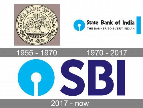
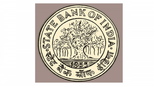
The original SBI logo was introduced in 1955, the years when the bank was established and featured a golden coin in a double outline, where the wordmark in Latin and Indian alphabet was placed. In the middle of the coin, there was an ornate and detailed image of a tree and a “1955” date mark under it. The tree here stood for growth, success, and wellbeing, reflecting the purpose of the financial organization and its approach.
1970 – 2017
The redesign of 1970 completely changed the design and style of the SBI logo, though the circle remained the main theme. Now it was a bold light blue rounded emblem with a vertical white element in its bottom part, resembling the keyhole, or a match, or a stylized abstract tree. The emblem could be used on its own or placed in the left from the wordmark, which was set in two levels, separated by a thin black line. The upper level of the nameplate consisted of an extra-bold lettering in a modern sans-serif, while the tagline “The Banker To Every Indian” in all capitals was written in a lightweight font with a lot of space between the symbols.
2017 – Today
In 2017 the logo was shortened and simplified, replacing the long wordmark and its tagline with an “SBI” abbreviation in dark purple. The new blue and purple color palette of the bank’s logo is a representation of the reliability and stability of the financial institution, along with its creative and progressive approach and courage. The bold neat lettering in a simple sans-serif typeface has the horizontal bar of the “B” shortened, which makes the wordmark lighter and adds elegance and individuality to the whole image.
In the fall of 1971, a new logotype was adopted, on which all the following versions have been based so far. The introduction of the logotype took place during the ceremony of the inauguration of the bank’s Central Office building in Bombay. The emblem was created by Shekhar Kamat. The main design element of the logo was a blue circle shape with a white gap.
One of the four possible interpretations suggests that the bigger circle symbolizes the bank as a whole, while the white circle symbolizes the client.
Other designers point out that the gap looks very similar to a keyhole, while the blue circle can be interpreted as a lock – a very old and common symbol for security and safety. In this case, the overall design may imply that the clients’ money is perfectly safe in the SBI.
Also, the smaller circle may represent an SBI office, while the white line is the street leading to it. At last, the logo might have been inspired by the Kankaria Lake situated in Ahmedabad, the city where the author of the logo studied design (Shekhar Kamat graduated from National Institute of Design in Ahmedabad).
Emblem
The core symbol of the State Bank of India logo has preserved virtually unchanged, yet the logotype itself went through an overhaul in 2017. Instead of the full name of the bank, the “SBI” abbreviation is used in dark blue or white.
Font
The modern sans serif typefaces chosen for the SBI logo has been heavily modified to convey the idea of “weight and heighten the institutional feel,” as the company’s official brief puts it. The geometric typeface boasts decent legibility and works well at greater distances. The distinctive feature of the wordmark is the gap in the letter “B,” which is supposed to create a visual harmony between the lettering and the emblem (which also has a gap).
Color
While the light shade of blue has been featured in the State Bank of India logo for several decades, the 2017 logo version adds a darker shade of blue and reduces the use of white. The combination of two shades of blue looks somewhat reminiscent of the color palettes used by digital banks and wallets like PayPal or PayTM, because of which SBI has been facing a tough time.


