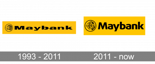
The visual brand identity of the Malaysian bank Maybank has been pretty consistent since 1993, although it went through a refresh in 2011.
Meaning and history
Maybank is considered one of the top 100 most valuable banks in the world, and the most valuable bank in its country, Malaysia. The Maybank was established in 1960 and is focused mainly on the local market, operating in several countries in the Asian Region. Apart from Asia, Maybank has branches in the United States, the United Kingdom, and such countries of the Middle East as Saudi Arabia, and UAE.
An interesting feature of Maybank is such a division as Islamic Banking, which is considered to be the largest Islamic financial organization of ASEA.
What is Maybank?
Maybank is the name of one of the most reputable banksin Malaysia, which was established in 1960, and today operates across several countries of the Asian region, including large branches in Indonesia and Singapore. Maybank is one of the world’s top 70 most valuable banks.
1993 – 2011
The previous Maybank logo was introduced the same year the company purchased Safety Life & General insurance Sdn Bhd.
The logo featured the word “Maybank” in black inside a gold rectangle. There was also a stylized view of the tiger’s head inside a black ring. The ring was placed inside the gold rectangle, too. The type was a pretty heavy one. Also, it looked very flat (squashed), which damaged the legibility.
In addition to the version with the gold square, a black-and-white version was used where the gold square disappeared.
2011 – Today
The design grew clearer and better-legible. The letters grew higher, due to which the feeling of lack of space disappeared. While the logo still featured the side view of the tiger’s head, the picture was redrawn. It now looked more attractive and cleaner.
The shade of gold became slightly different, more vivid and sunny.
According to the company’s press release, the updated design represents its “strength and leadership especially in the region.”
Font and Color
The heavy modern title case lettering from the primary badge of Maybank is set in a progressive sans-serif typeface with smooth futuristic contours of the stable letters. The closest fonts to the one, used in this insignia, are probably, Phoenica Std Bold, or Aeonis Pro Heavy, with some minor modifications of the letters’ contours.
As for the color palette of the Maybank visual identity, it is intense and bright, and consists of a dark shade of yellow and black, a combination that evokes a sense of energy and motion, and looks powerful and stable, with a very strong mood and dynamic image. The color scheme of the logo makes it stand out in the list of the bank’s competitors.
The type featured in the Maybank logo is a bold sans looking very much like FF Dax Wide ExtraBold. One of its distinctive features is the presence of the unusual curved elements on the “a’s,” “b,” and “n.” On the whole, the current type looks more modern than its predecessor.
Company overview
Maybank is the brand under which Malayan Banking Berhad operates. It is a universal bank headquartered in Kuala Lumpur, Malaysia. The list of its main markets includes Malaysia, Singapore, Philippines, and Indonesia.
The bank was founded in 1960. The number of employees reaches 45,000.


